
The 3-minute trick that changed my portfolio
Yes, there's a Figma trick. Also included: portfolio therapy and making your work feel more you (not just pretty).

May 27, 2025
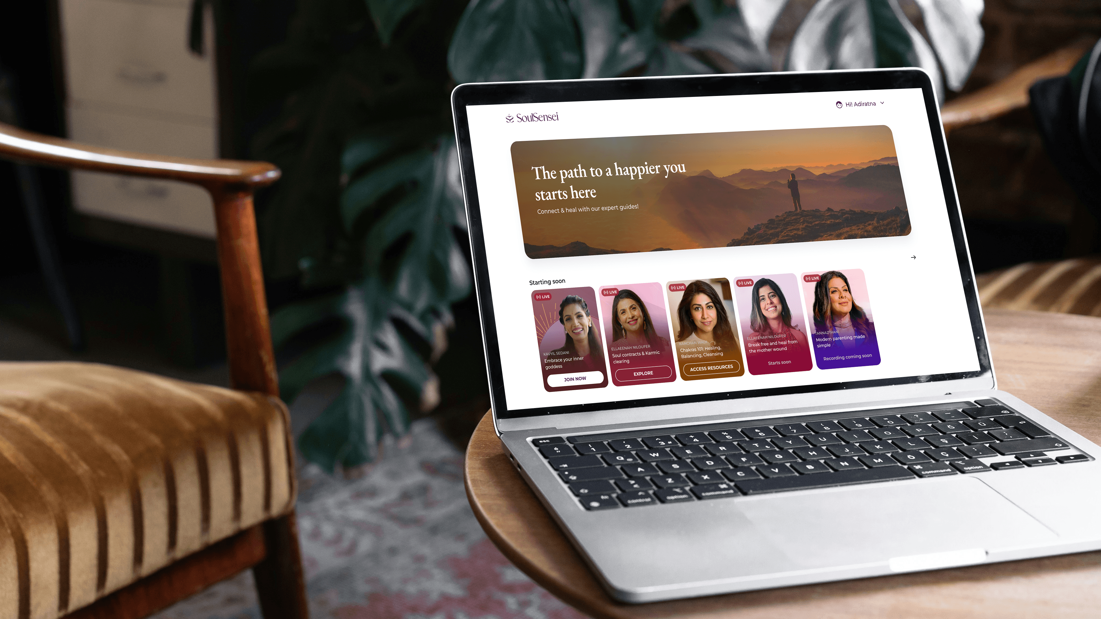
How to get your portfolio mockups to look like this!
TLDR; Portfolios aren’t about perfection, they’re about process. In this post, I reflect on why portfolios feel so hard to make (and why that’s a good thing), what they really reveal about us as designers, and how I approach mine as a living design archive. Plus: the 3-minute mockup trick I now swear by, using Figma, Unsplash+, and the Easy Mockup plugin, to create product shots that feel real, not just pretty. It’s fast, it’s simple, and it actually works.
Just last week the topic of designing our portfolios came up in my friend circle, and all of unanimously ranted about how it’s our least favourite task. And that got me thinking…
Just last week, my friends and I did what we do best: complained about something we all have to do but secretly hate. This time, it was portfolios. The collective groan was audible across Whatsapp. And that got me thinking about how the portfolio ends up being the most important document you'll ever create. Not because it gets you jobs (though it does), but because it forces you to confront who you actually are as a designer.
The mirror you do not want to look into
No designer enjoys crafting their portfolio. It's archaeological work—digging through old Figma files, trying to remember why you made that chose a secondary button over a primary, piecing together the narrative of projects that felt chaotic while you were in them. It's tedious, emotionally exhausting, and weirdly vulnerable. I’m tired just thinking about it.
But here's what I've learned after building for millions of users and reviewing hundreds of portfolios: your portfolio isn't just a collection of pretty screens. It's your design autobiography. Every project tells a story not just about what you built, but about who you were when you built it.
When I look at my portfolio from five years ago, I cringe. Not because the work was bad, but because I can see exactly where my thinking was limited, where I took shortcuts, where I was too junior to ask the right questions. That's the point. Your portfolio is a time capsule of your growth, its a moment of self-reflection, whether you like it or not. It’s a museum and you’re the solo artist on exhibition.
Portfolios tell you more about the designer, than the designer themselves
I've reviewed portfolios for senior design roles at several companies now, and I can tell you something uncomfortable: your portfolio reveals more about you than you think it does.
The designer who leads with their most polished visual work but can't explain their process? They're probably not strategic thinkers. The one who spends three paragraphs on their design system but glosses over user research? They're likely more in love with their craft than their users. The portfolio that reads like a startup pitch deck? That designer probably hasn't learned to separate their ego from their work yet.
Sarah Doody, who runs a UX portfolio course, puts it bluntly: "Most designers think their portfolio is about their work. It's actually about their thinking." She's right. When I'm hiring, I'm not just looking at what you built—I'm looking at how you think, how you collaborate, how you handle ambiguity.
The best portfolios I've seen don't just show solutions; they show the messy, human process of getting there. They admit mistakes. They explain constraints. They give credit to teammates. They reveal a designer who's comfortable with complexity and honest about their limitations.
My portfolio is my archive
I treat my portfolio like an archive because that's what it is. Not a highlight reel, but a historical record. Each case study is a deep dive into a specific moment in time—the constraints I was working within, the team dynamics, the business pressures, the technical limitations.
Don’t they say it’s not just about the ending, it’s the journey that matters.
Writing 2,000-word case studies sounds masochistic, and honestly, it kind of is. But here's the thing: when I sit down for portfolio reviews or job interviews, I don't need to scramble to remember details. I've already done the work of excavating the story, the lessons, the evolution of my thinking. The case study becomes my interview prep.
More importantly, it becomes my therapy. Looking back at a project six months later, I can see patterns I missed in real-time. I notice where I could have pushed harder, where I should have asked different questions, where I let politics override good design decisions. It's uncomfortable, but it's also how you grow.
The artefacts that actually matter
Here's where most designers get it wrong: they think pretty mockups equal good portfolio pieces. I've seen countless portfolios that look like Dribbble shots—gorgeous, glossy, and completely divorced from reality.
Your portfolio needs artefacts, but not the kind you think. Instead of just design shots, show:
The whiteboard session where you finally cracked the problem
The Slack conversation where stakeholders pushed back on your initial concept
The user research notes that changed your entire approach
The iteration that didn't work and why
The constraints you were designing within
When I create my portfolio, I'm not trying to make my design look perfect. I'm trying to make it look real. That sometimes means showing screenshots of the actual product, with all its compromises. It means talking about the technical debt that limited my options, or the budget constraints that ruled out user research.
Yes, it still needs to look good
Everything said and done, at the end of the day it is the portfolio of a product designer. The case study needs to go hand in hand with a brilliant visual archive of your designs. The photos need to communicate not just the design clearly but also provide context to the reader.
Here are some design shots from my own case studies:

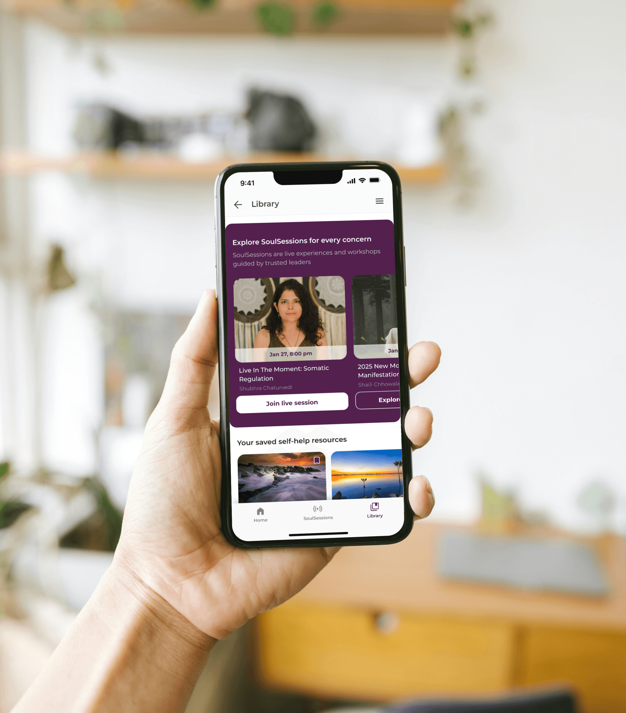
I looked long and hard on how to create great product mockups, that didn’t look like mockups, but were a true reflection of how my designs were used and embraced by its users. I wanted the photos to communicate more than the design. I wanted it to be a photographic representation of the product in use. And I was beginning to realise I might have set out on an impossible task. I thought, short of photographing the moments myself, it was going to be impossible to.
That is until I stumbled into this setup and I only realised what a gold mine it was when a few other designers asked me how I was doing it.
The 3-minute magic trick
It's deceptively simple, which is why it works.
You'll need Figma, the Unsplash plugin (paid version if you're using this commercially), and the Easy Mockup plugin. That's it.
Start with your actual design file, maybe not a cleaned-up version, the real thing.
Use Unsplash to find environmental photos that show your product in context (coffee shops for mobile apps, offices for desktop tools).
Use the Easy Mockup plugin to place your designs naturally in these environments.
The key is choosing images that tell a story about how your product is actually used. A banking app shown in someone's kitchen while they're paying bills tells a different story than the same app on a pristine white desk.
Important disclaimers for the magic trick
Commercial rights matter: If you're using these for job applications, you need commercial usage rights. Gaining employment through these images constitutes commercial gain.
Credit where credit's due: If using Creative Commons images, attribute the photographers. Respect photographers' work the same way you'd want your design work respected.
Unsplash+ consideration: Gives you access to better product mockup stock images with commercial usage rights.
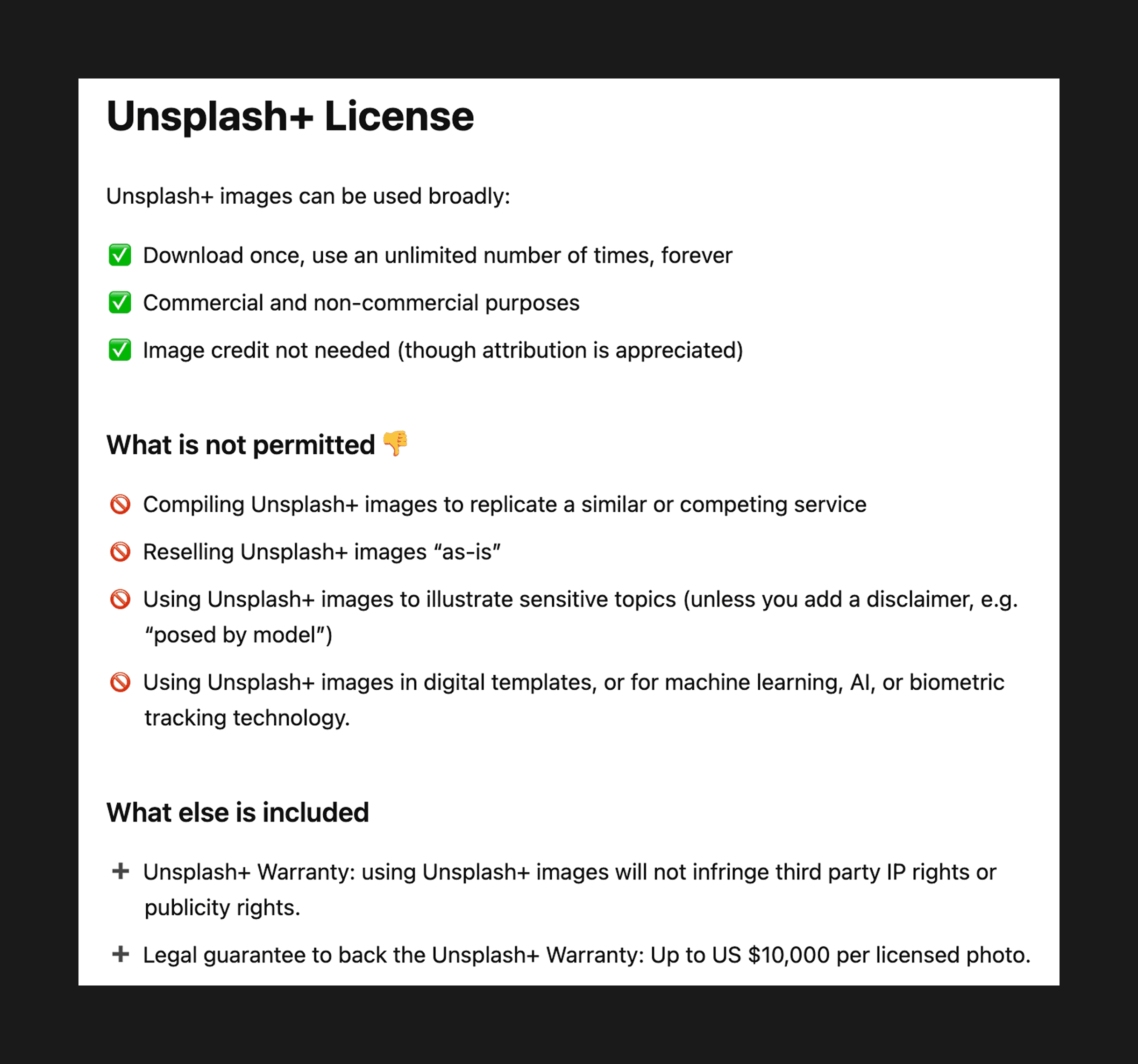
Support creators: If Easy Mockup plugin works for you, consider buying the creator a coffee. The design community thrives on mutual support.

Your portfolio, a living document
Your portfolio is never finished, and that's the point. It's a living document that evolves as you do. Every few months, I go back and add new insights to old case studies. What seemed like a success six months ago might reveal its flaws over time. What felt like a failure might prove to have planted seeds for future breakthroughs.
This isn't about maintaining a perfect narrative—it's about maintaining an honest one. Your portfolio should capture not just what you've built, but how you've grown. The mistakes, the breakthroughs, the slow evolution of your thinking.
The designers I most respect aren't the ones with the prettiest portfolios. They're the ones who can tell the most honest stories about their work, their process, and their evolution. They're comfortable with complexity and honest about their limitations.
Your portfolio isn't your highlight reel. It's your design autobiography. Write it honestly, and it might just teach you something about yourself.
Until next time, ✌️