Johnson’s changed the Q-tip: Why Tho
Why even the smallest products deserve thoughtful UX

Jun 3, 2025
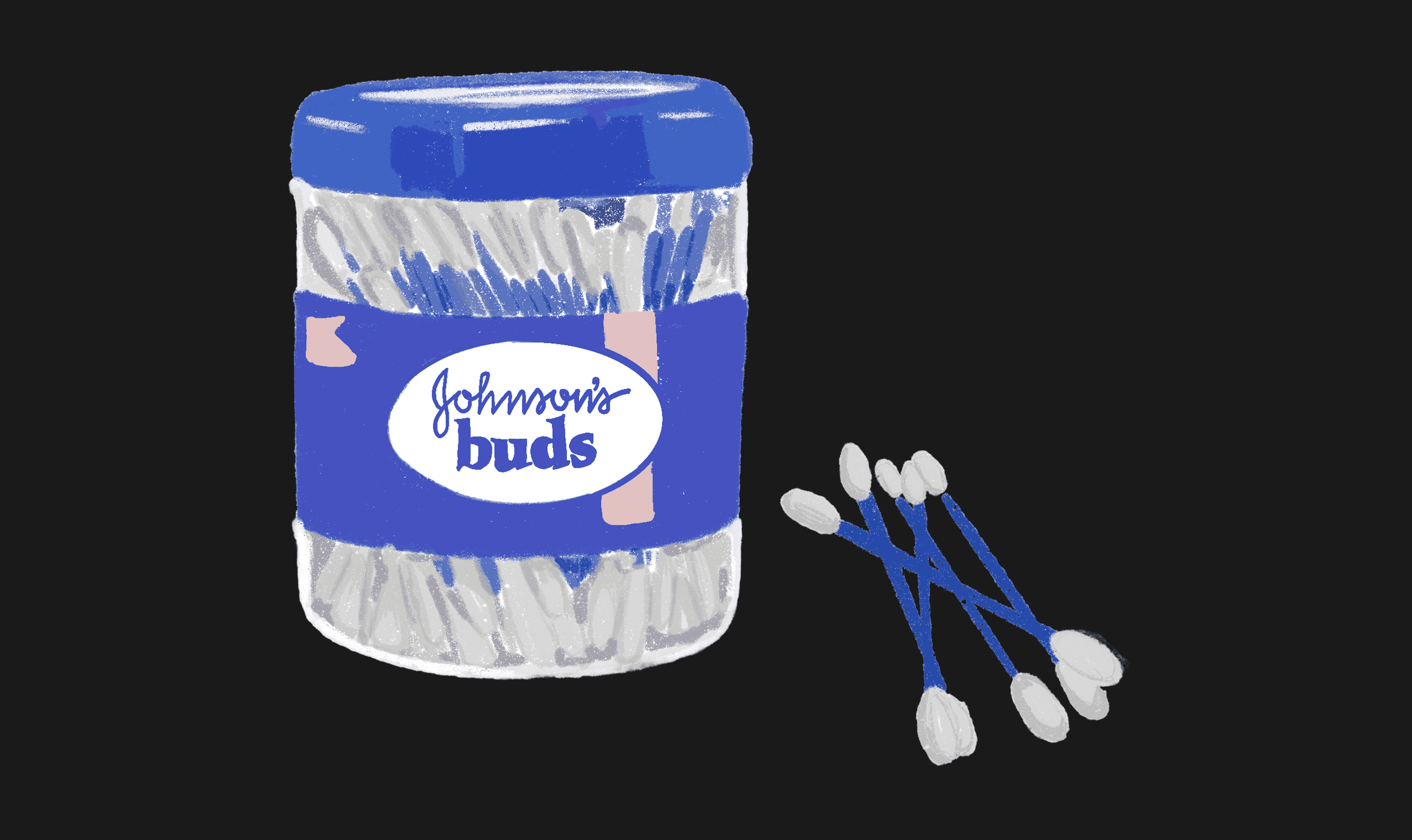
Illustration of the Johnson & Johnson cotton bud box, © Tanya Rao
The second object we will look at in our Why Tho? series is the humble humble cotton bud or Q-tip for my American readers. Some of us use it everyday, most of us have used it at least once. We rarely ever think about it other than when we need to buy it.
Before we get into that, if you are new here, Why Tho? is a series of design reviews where I over-analyse the usability of everyday things, so you don’t have to. Sometimes it includes app and websites. Today’s episode is about the Johnson & Johnson cotton buds, because why not!
If it feels too far off the left-field, bear with me. It’s going to make sense! Imo usability should not be limited to digital apps and experiences alone. We are users of so many objects everyday, and we can learn a lot from just paying attention to our own usability experiences, offline or online.
Personally I have used Johnson & Johnson’s cotton buds for as long as I can remember. It’s been a part of my vanity since I was responsible enough to bathe myself. And as a user of J&J cotton buds of 20 years, I have my own unique way of cleaning my ears - the way I twirl it in my ear, how I use my right hand to shove it into my left ear, far enough that it borders on an emergency.
When good intentions met poor execution
My entire user experience and subsequent user behaviour was based on the design of the cotton bud itself. “I was born in it, moulded by it.” For as long as I remember, it has been a blue plastic tube with cotton stuck on either end. Because of the plastic tube it was quite was rigid, which meant it held it’s shape and didn’t bend and fold. And the cotton was thick, so you used an end for each ear. But most importantly, it didn’t disintegrate and it did not poke. Simple. Reliable. The kind of product that just worked without making you think about it.
But then one day, what I believe to be an environmentally conscious leadership somewhere, decided to reduce single use plastic and Johnson swapped the plastic tube to a paper stick in it’s cotton buds. A wise choice from any angle, and this isn't a judgment on the plastic-to-paper swap. As we will see later, paper makes for a great substitute. The irony however is that even though the stick changed to paper, the cotton buds themselves still come in a plastic box! So much for corporate social responsibility.
It feels to me that J&J’s new “product spec” for the Q-tip, even though environmentally conscious, was not backed by market research or usability testing.
The new design broke 20 years of muscle memory
What had become a thrice weekly routine for over 2 decades, now had to be relearnt because of the redesign of a single component. Here I was, a grown adult, suddenly incompetent at cleaning my own ears. The new paper tube was flimsy at best. It bent at right angles as soon as it touched your ear—like it was designed by someone who'd never actually used a cotton bud.
I understand that this could be due to safety concerns - if the tube was too hard you could grievously hurt your inner ear canal. My follow up would be, wouldn’t the new and sudden folding of the stick catch the user even more unaware leading to greater harm? It's the design equivalent of removing guardrails to prevent people from leaning on them.
Cognitive Dissonance is discomfort users experience due to conflicting ideas or behaviours, such as when a design contradicts their existing habits.
To top that, the new cotton on the ends was a mere shadow of it’s thick and fluffy past. It made an already subpar experience even worse. Now the stick warped inside your ear and the smaller cotton patch meant the stick poked you at the worst moments. I found myself longing for the good old days when my biggest worry was using the same end twice by mistake.
Critical questions J&J should have asked
That begs me to ask a few questions, some to the Johnson & Johnson’s team responsible for these design choices.
Did Johnson’s think about the implications on it’s users due to this change, beyond the business and climate impact?
Did it undertake any market or competitive research?
Did J&J test the new product with focus groups before releasing it?
And for us as designers and users: Should they have considered user impact? What responsibility did Johnson's owe to its consumers?
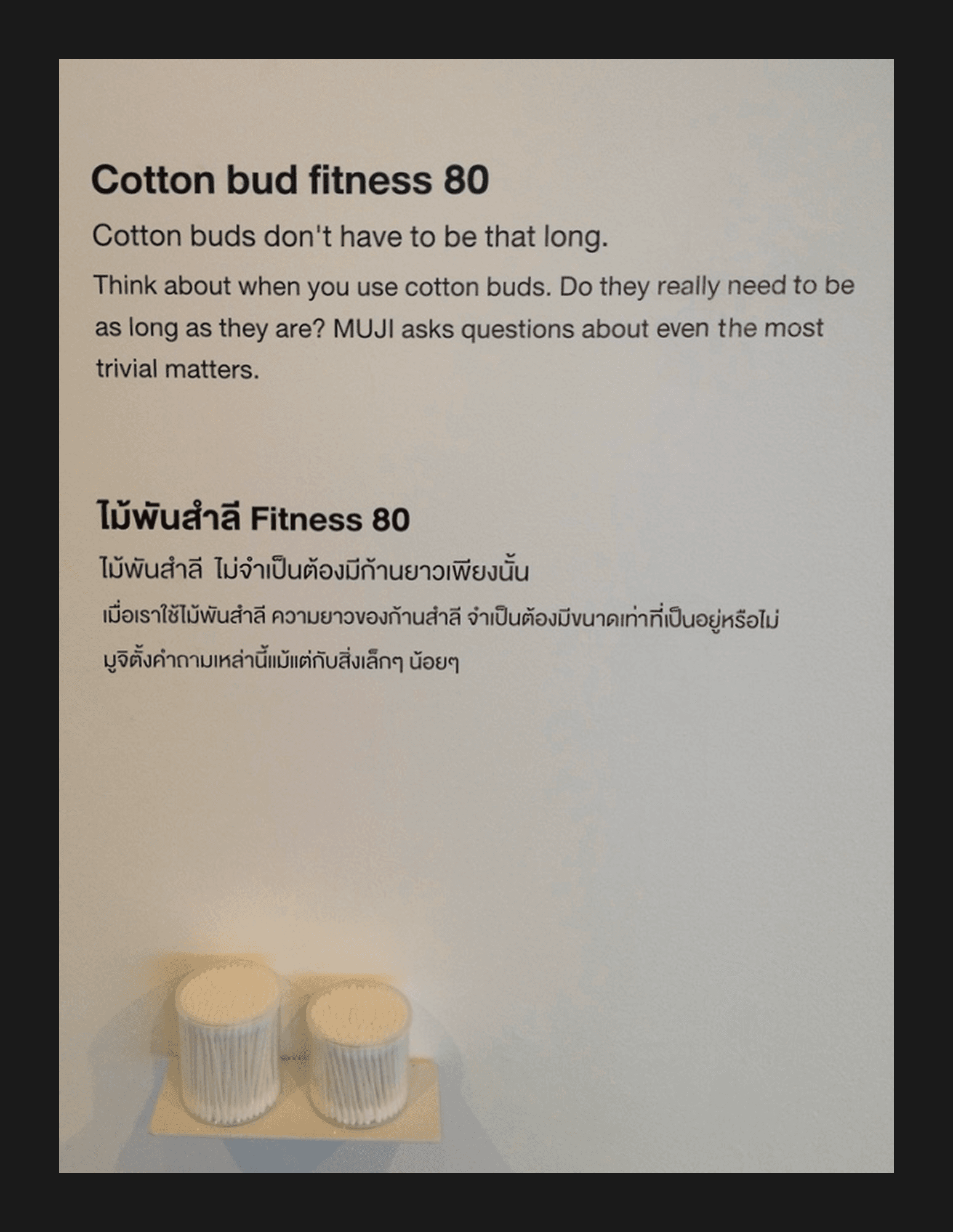
Muji asking all the right questions! Source: Pinterest
A missed opportunity for thoughtful redesign
I believe Johnson's held significant responsibility toward its users, including me. As a long-time loyalist, I appreciate the move toward a plastic-free world. But this redesign feels rather uninformed, the kind of decision made in boardrooms by people who probably have assistants to clean their ears?
A quick market survey reveals many cotton bud brands successfully executed paper sticks. A great example is Muji cotton buds. They use a similar approach but their stick is stiffer. It doesn't bend or fold unexpectedly. Some variations come with spiral cotton swabs for easier ear cleaning or pointed tips for makeup cleanup. Imagine that! A company that actually thought about different use cases.
The fact that cotton buds still come in plastic packaging suggests this wasn't well-thought-out execution. Rather, it was a patchwork solution. In my opinion J&J should have found a way to make the paper sticks as sturdy as the OG plastic ones. This would have meant a shorter learning curve for users, especially repeat customers who wouldn't have to relearn ear cleaning. And hopefully wouldn't send them searching for alternatives—which, spoiler alert, they did anyway.
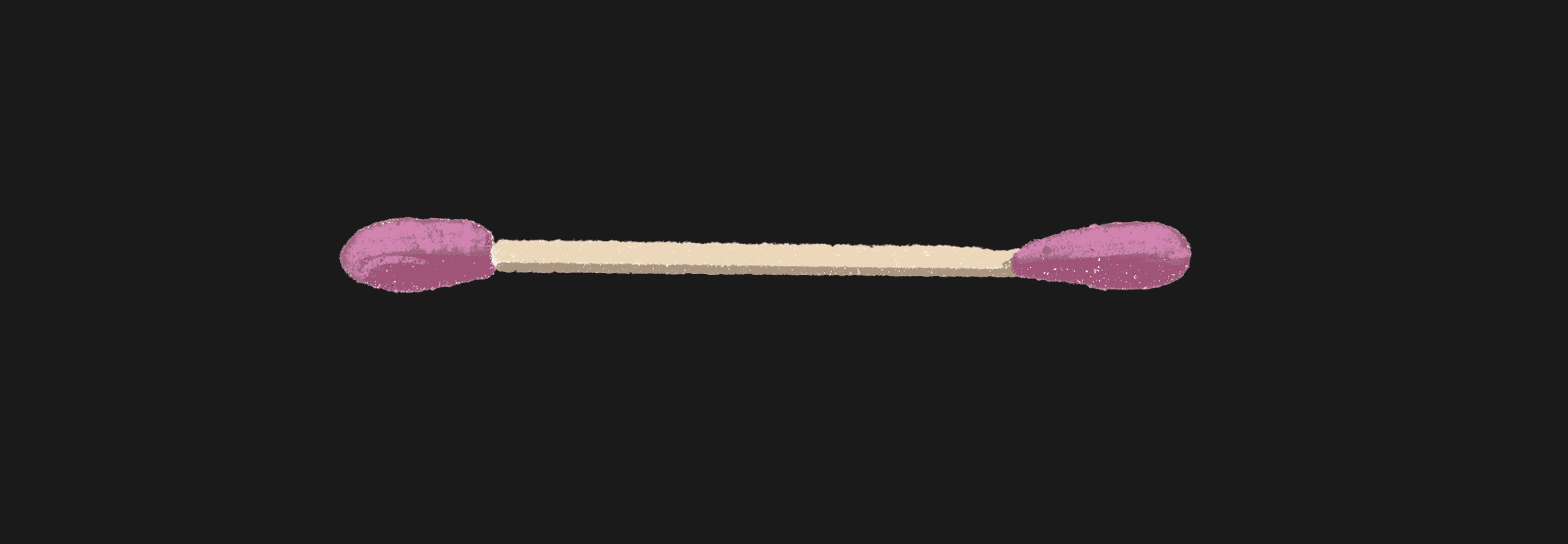
Illustration of a cotton bud © Tanya Rao
What can we learn as UI UX designers?
Good intentions need good execution
Well-meaning changes can backfire if they disrupt usability. Sustainability, accessibility, or business goals must balance with user experience. A "better" solution that frustrates users isn't really better. It's just better on paper (pun was very intended).
Test before you frustrate
J&J’s redesign overlooked how users actually interacted with their product. Small design tweaks can have big consequences, so usability testing is non-negotiable. If users have to relearn something simple, you’ve already lost them. Whether it's a cotton bud or a checkout flow, the principle remains the same.
Don’t break muscle memory without a good reason
Long-time users develop habits around products. Whether it's cotton buds or app navigation patterns, abrupt changes without considering existing behaviors create frustration, not innovation. We are creatures of habit, and habits die hard—especially the ones involving small objects we stick in our ears.
Loyalty is earned, not owed
Users stick around because a product works for them. If a redesign makes their experience worse, they will explore alternatives. Brand name alone isn't enough, ease of usability keeps people coming back. This applies whether you're designing a mobile app or manufacturing bathroom essentials.
Competitive research matters
J&J wasn't the only company switching to paper sticks, yet other brands managed to maintain usability. As designers, we should always look beyond our own work—analysing competitors and industry best practices can help us avoid common pitfalls. Sometimes the best ideas are hiding in the most mundane places.
From user-centred to user-confused
There’s something quietly tragic about a product designed to be invisible in your routine, suddenly making itself known for all the wrong reasons. The cotton bud is not a product I ever wanted to notice. It was a background character, not meant for a character arc. And yet here I am, re-evaluating my grip strength come every bath time.
This isn’t a takedown of sustainability. Quite the opposite. I’m rooting for the planet, biodegradable everything, and yes, even paper sticks. But good intentions don’t excuse bad design. Especially not from companies with the resources and responsibility to do better. The switch from plastic to paper wasn’t the problem. The lack of usability testing, feedback loops, or even a moment of design humility, that’s where it all crumpled. Literally.
Even the most invisible products deserve design rigour. If your redesign makes people re-learn how to use a stick with cotton on it, something’s gone sideways. Test earlier. Prototype harder. And if all else fails, ask yourself: would I use this everyday?
Until next time, ✌️