The EDC toolkit of a product designer
Free tools that actually work (when your design budget is just vibes)

May 13, 2025

A messy work desk is my preferred way of working.
"A man is only as good as his tools," said Emmert Wolf (or so claims the internet, with its usual certainty about dubious attributions).
That might have made perfect sense when your dinner depended on the sharpness of your spear, but does it hold up in the digital jungle? Photographers argue endlessly that it's not the $4,000 camera making great photos but the person behind it. So how much do tools actually define our work?
If you're asking me—and since you're reading this, I've decided you are—they make a considerable difference, just not in the way most people think.
I stumbled into the world of Everyday Carry (EDC) culture a few years back. While traditional EDC (Everyday Carry) is about surviving a hypothetical wilderness apocalypse with titanium pocket knives and flashlights that cost more than your monthly grocery budget, my EDC is about surviving product design sprints and the absolute chaos of determining whether that drop shadow needs to be at 20% opacity or 25% to convey "premium but approachable" at 11 PM before tomorrow's deadline.
My EDC isn't strapped to my belt—it's in browser tabs, plugin panels, and muscle memory. These are field-tested tools I actually use, and—perhaps most importantly—they're all free.
Discovery and ideation: when you have nothing but a deadline
The earliest phase of any design process involves gathering information when you have virtually no idea what you're doing yet. Whether you're deciphering product specs written by someone who clearly hates clarity, debating user journeys with stakeholders who've never met an actual user, or refining a product strategy that changes hourly, you should be assembling what James Webb Young called "a rich pool of raw material—mental resources from which to build new combinations." The tools at this stage should support the aggressive pursuit and cataloging of anything that might spark creativity later.
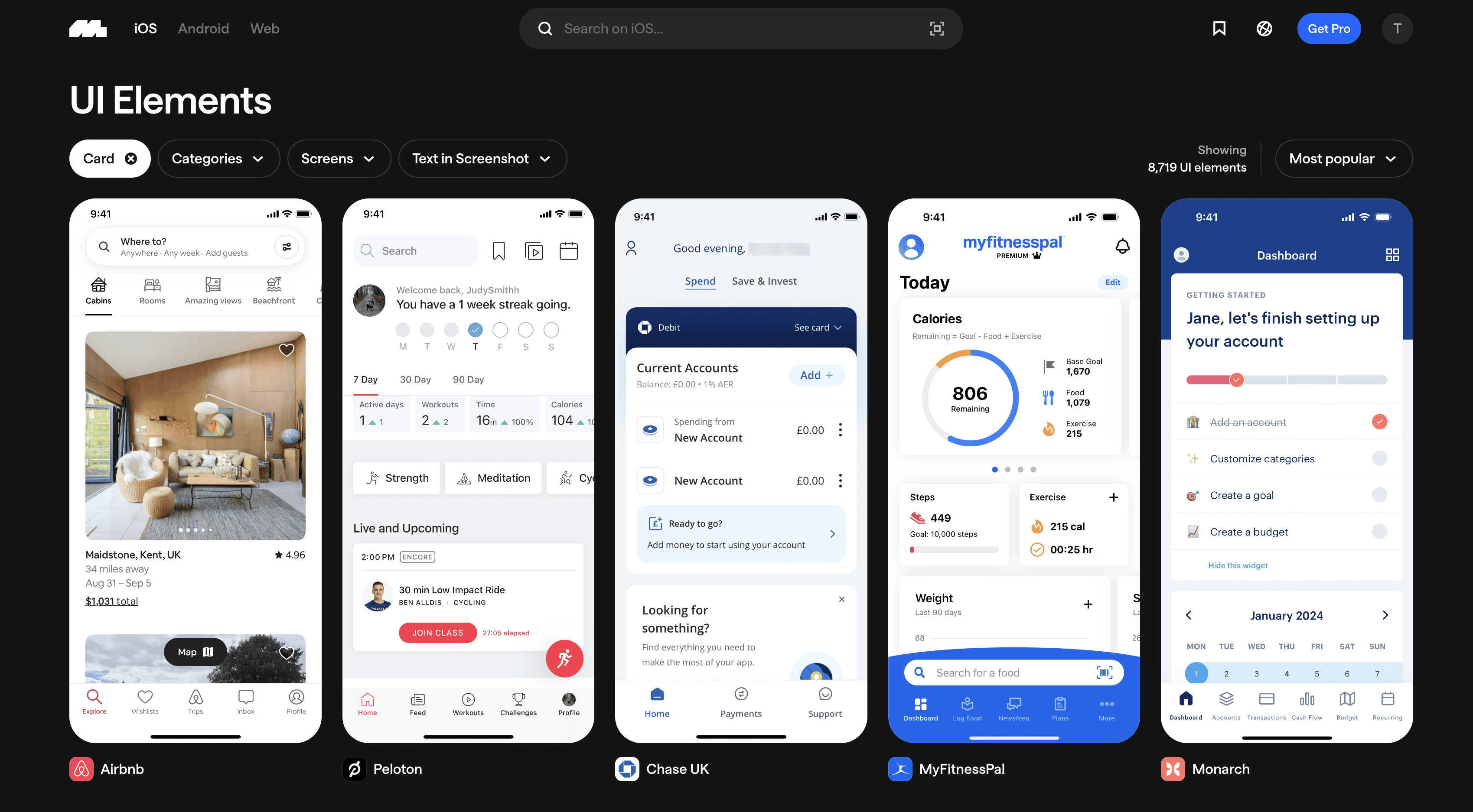
Mobbin has become my go-to resource, providing "over 400,000 screens and 1,000 iOS, android & web apps." Unlike the fantasy worlds of Dribbble and Behance—where impossibly clean designs exist unburdened by actual users or business constraints—Mobbin shows designs that have survived contact with reality. While Mobbin restricts how many screens you can see on the free plan, use the search function to circumvent their paywall like the crafty designer you are.
Pinterest remains surprisingly useful for website design examples. The platform's black hole-like algorithm creates endless rabbit holes of similar designs, letting you explore variations on a theme until you forget what day it is.
For B2B/SaaS designs, SaaSUI.design and SaaSFrame offer extensive databases of dashboard designs from companies who've already solved the problems you're facing. SaaSFrame loads at the speed of continental drift, but the wait is usually worth it.
Landing Folio provides excellent web design inspiration when you need to see how other people have tackled boring content in interesting ways.
The final and most humble tool in this section is the unfashionable combination of pen and paper. I've tried every notes app ever conceived by Silicon Valley, but nothing approaches the speed of scribbling barely legible ideas during product discussions. Don't waste money on expensive journals with fancy dots and grids—printer paper and whatever pen you stole from a hotel works perfectly fine. Your best ideas rarely care about the paper quality.
Wire-framing and concept testing: when ideas need to become slighlty more real
By now you've hopefully accumulated enough concepts to pretend you know what you're doing. In days past, I would have opened Figma and manually created wireframes for each concept like some kind of digital peasant. Thanks to AI, I can now offload this labor and busy myself with other tasks on the to-do list.
Instead of dragging gray boxes around Figma until my wrist gives out, I now write prompts for AI tools like Lovable, v0 and Bolt simultaneously. I feed each a different concept via prompts, partly because they excel at different things, but mostly because I'm on free plans and spreading my usage prevents hitting token limits too quickly. Don't look at me like that—we all do it.
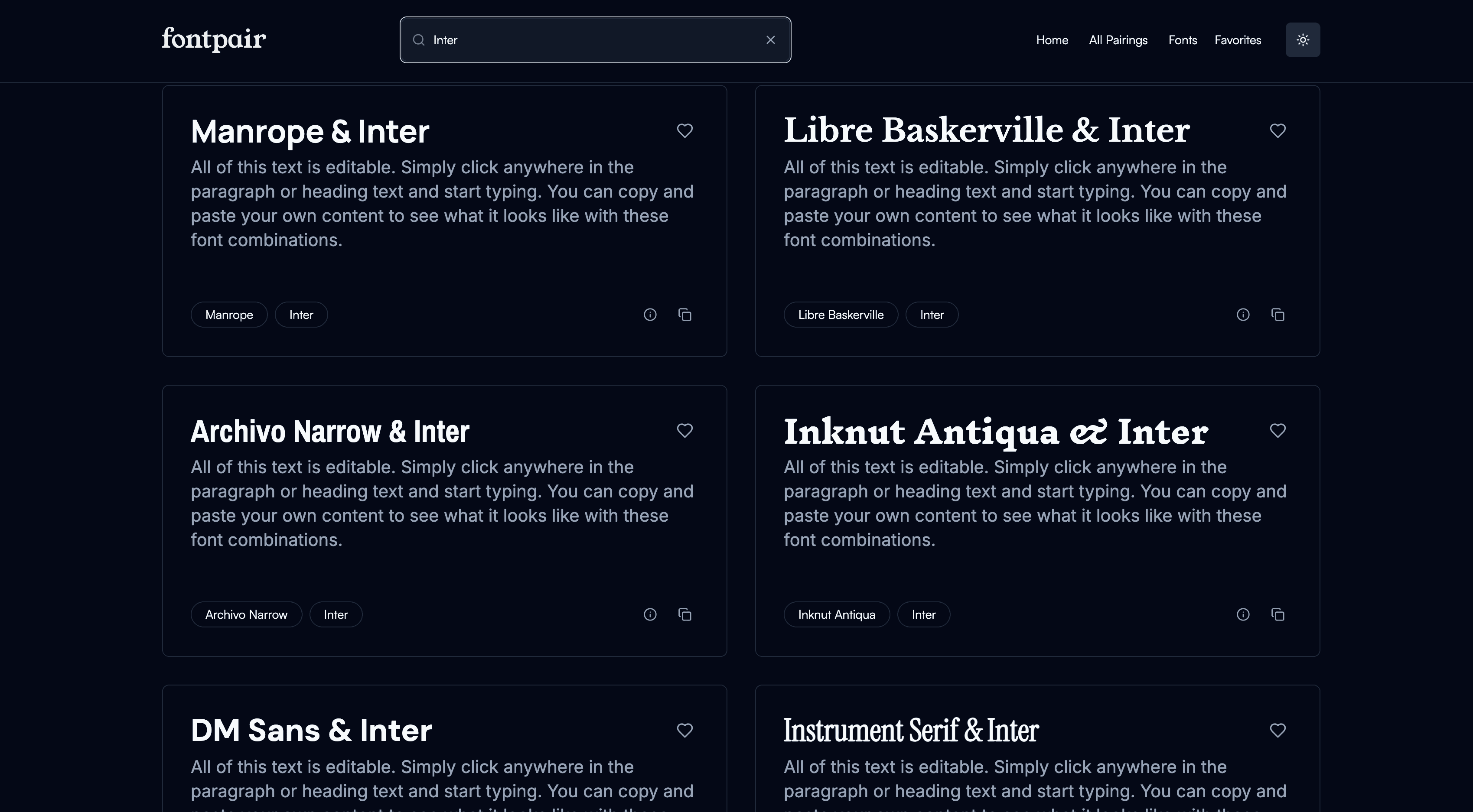
If you're working outside a design system and find yourself questioning font pairings with the intensity normally reserved for existential crises, Fontpair provides ready-made typography combinations that won't make your design lead wince. During a recent product exercise requiring three distinct design directions, I blindly followed FontPair's suggestions and nobody questioned my typographic expertise.
This shouldn't need saying in 2025, but if you're not using Figjam for feedback sessions and design sprints, you're making life unnecessarily difficult. Its built-in templates, stickers, and voting features transform what should be excruciating group exercises into merely uncomfortable ones.
Let the designing begin: when aesthetics finally matter
At this point, you should have low-fidelity wireframes with high-fidelity aspirations. Now you begin adding color and delight, readying your screens for stakeholder reviews where they'll inevitably ask why everything isn’t in the first fold.
If you struggle with color palettes like I do, Sado Wanzo's Dictionary of Colour Combinations will change your life. Wada Sanzo (1883-1967) was a Japanese artist who devoted his life to color theory when the rest of us were still figuring out crayons. His work offers 348 beautiful color combinations that make you look like you understand color theory without actually having to learn it. You can use either the website or the Figma file as your starting point.

Other worthy color tools include Spectrum for creating palettes from a single color (use the website, the Figma plugin costs actual money), Coolors for pre-made combinations, and the Canva Colour Wheel if you enjoy the illusion of control.
Even if you work with content designers, taking a first stab at UX copy ensures your design properly supports the user experience. I use ChatGPT and Perplexity to refine language until it sounds like it was written by a human who cares—or at least by an AI pretending to be a human who cares.
For animations, Lottiefiles provides excellent placeholders until you can create something better (or, let's be honest, until you decide the placeholders are good enough). The Figma plugin lets you add GIF or SVG versions to your static screens, making them feel dynamic even when they're fundamentally not.
For imagery, Unsplash (photos) and Pexels (videos) offer free stock assets that don't immediately scream "I found this in a stock library." The Unsplash plugin has saved me countless hours of image hunting.
For icons, Google's Material Icon Library remains unmatched in its comprehensiveness and comes with a handy Figma plugin. I've also grown fond of Phosphor, which offers a less corporate, more playful aesthetic when you need icons that don't look like they belong in enterprise software from 2018.
For illustrations, I haven't found a single library that satisfies all needs, but Pablo Stanley's Humaaaans remains a reliable standby. Yes, they're everywhere, but there's a reason for that—they work. I often combine them with UnDraw for more variety. Recently, I've also started using ChatGPT to generate custom illustrations when I can't find what I need or—let's be real—when I'm too lazy to make something myself.
The frequently overlooked Figma mobile app deserves special mention. It provides real-device previews of your Figma frames with working prototype interactions, revealing design flaws that remain invisible on a 27-inch monitor. Just download the app and login with your credentials.
Async design walkthroughs: when you can’t be bothered with another meeting
As your design phase concludes, you'll need to share your work asynchronously because nobody wants another meeting that could have been an email (or in this case, a video).
Loom remains the gold standard here. The free plan allows 25 videos monthly, and it's genuinely foolproof—hit record, explain your design choices while gesturing vaguely at various elements, send link, done.

You could use MacOS's built-in screen recording with cursor tracking, but I've found it about as reliable as weather forecasts. Loom's desktop app just works, which is all I really want from technology at this point.
Getting Figma production ready: when engineers actually need to build you fever dream
The final stage involves preparing your designs for development handoff—a process I historically procrastinated until the last possible moment because writing UX specs feels like filing taxes. However, two Figma features have made this significantly less painful:
Figma's annotate and measure tools have revolutionized how I create UX specs. These features are accessible to developers in Dev Mode, making it easy to leave notes and measurements across screens without creating separate documentation that nobody will read anyway.

For accessibility checks, I use Able, a free Figma plugin. While Figma has recently released a built-in contrast checker, I still prefer Able for checking accessibility across various text sizes and backgrounds because it feels more comprehensive.
Conclusion: tools don't make the designer, but they sure help
And that concludes my humble design EDC. While these tools won't transform you into a design savant, they might save you time, prevent needless suffering, and occasionally make you look like you’re underpaid.
Good tools used appropriately don't just streamline workflows—they create space for actual creative thinking in schedules increasingly devoid of it. They're the difference between spending three hours manually aligning elements and spending 15 minutes on alignment while devoting the remaining time to solving actual design problems.
I'd love to hear about your favorite tools and shortcuts. Drop them in the comments or reply to this email, assuming you've read this far and aren't just skimming subheadings while on a bathroom break.
Until next time, may your gradients be smooth and your stakeholder feedback specific. ✌️