Uniqlo’s nav just got a makeover—Why Tho?
A deep dive into Uniqlo’s navigation redesign—what changed, why they likely did it, and how the current experience can be improved.

May 6, 2025

An online shopper shopping online on Uniqlo's desktop app, with the mobile app open on the side.
Welcome to another week, another design newsletter. When I started this Substack a month ago I was unsure if writing every Tuesday is a commitment I would be able to keep up. As time has gone by however, I have come to look forward to writing and publishing on Tuesdays. It has allowed me to reconnect with a hobby that has always brought me a lot of joy. And even though there are just a handful of us right now, I would like to thank you for taking out the time to read this newsletter. When we are surrounded with content, consider me honoured every time any of you chooses to read The Cognitive Load.
Let’s dive into this week’s essay, shall we?
What is Why Tho?
Why Tho?, hoping I’ve aptly named it, is a place where I over-analyse everyday things so you don’t have to. As UX designers, we obsess over how people interact with apps and websites. This series is an attempt to broaden the horizon of what we consider “user experience design”.
We spend our lives surrounded by design, from the buttons in our cars to the twisty caps on our toothpaste. Some of it works so seamlessly we barely notice it. Some of it makes us question our very existence (ever tried opening a package of scissors without scissors?).
In this series called “Why Tho?” we will observe, critique and understand design that is all around us - from cotton buds to delivery apps. We will also find solutions when we don’t like the answers. We will not just celebrate good design, we will also question what makes design good or bad. This series is about seeing the world through the lens of usability, sometimes efficient, sometimes frustrating and sometimes hilarious.
Dissecting Uniqlo’s navigational revamp
We are starting strong, with the first in our series to be Uniqlo. If you’ve never crossed paths with Uniqlo, it’s a Japanese fashion brand famous for it’s quality, style and affordability. You didn’t ask, but I am a Uniqlo loyalist! The clothes, the price point, the style 🫰 In closets full of Zara and H&M, Uniqlo is the stand-out luxury!
Anywho, Uniqlo revamped their website and app some time last year. As an avid shopper (cough, shopaholic) I’ve spent countless hours in store and online, browsing their catalog, window shopping, actually shopping or returning my shopping. Which is why when they rolled out their new redesign, it immediately caught my eye but also threw me off my behavioural patterns (they were muscle memory at this point). I had to reacquaint myself with their layout and after having lived with this new layout for a few months now, I still find some aspects of it somewhat strange.
In my opinion navigation was one of their biggest modifications, not so much visually but experientially, and that’s my primary focus in this blog post.
(Out with) the old

The old Uniqlo desktop-web home page.
The old Uniqlo website had a universal top navigation which isn’t new for the internet. We see it everywhere in the e-commerce realm, from Amazon to Shopify powered websites.
There are a few strong reasons why this approach has become a default:
Optimised for browsing: Shoppers can largely fall into 2 buckets - they know what they want (users will “search” for an item) and/or they want to browse (users will “browse” the category menu like aisles in a store). What a top navigation hopes to do is capture both types of users right at the top of the page, whether you’re an impulsive buyer or a discovery shopper.

Category drop-downs in the top navigation capture the online shopper here to “just browse”.
Low cognitive load and user familiarity: Because the top navigation approach works so well, e-commerce has universally adopted it as the default. That has translated to a low cognitive load behaviour for online shoppers. We as users have just come to expect Search and Categories at the top of the page, the same way we have to come to expect it at the bottom in iOS/Android. This has bred user familiarity in our minds.

Search in the top navigation is low cognitive load, users have learnt where to find search.
Leads to higher conversion rates: As a result the top navigation—from Search, Login, Profile, Favourites to Cart—leads to healthy conversion rates across most e-commerce categories.

Top navigation across most e-commerce website follow the same top navigation combinations because it works!
(In with) the new
Armed with an understanding of why it became an industry norm, let’s take a look at the new Uniqlo top navigation.
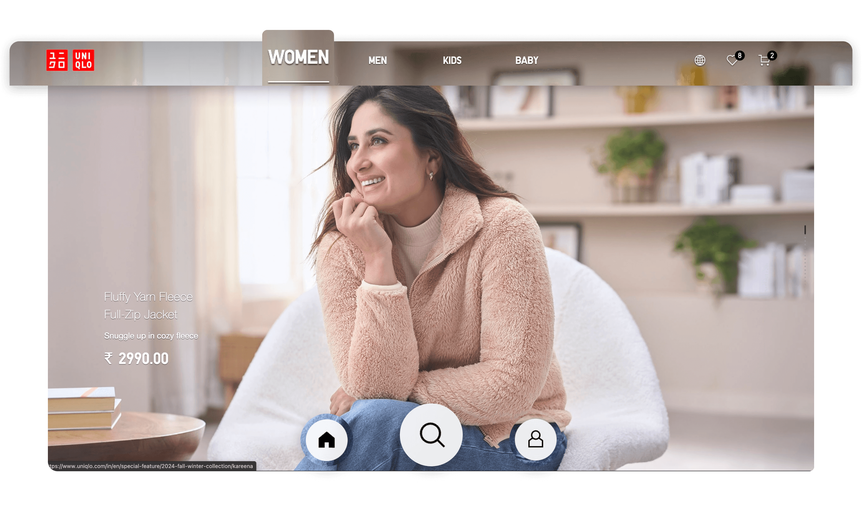
Uniqlo’s new desktop website with Categories on the top and Search at the bottom.
At first glance we notice that some elements have moved to the bottom of the page - namely Home, Search and Profile, while Categories remain at the top of the page. This is where I started tripping, because I had to break away from muscle memory and bring back focus to the task at hand - shopping was no longer a passive exercise.
Categories become Tabs: The old Uniqlo website had instilled in me that tapping on Women, Men, etc. would bring up a list of sub-categories like Outerwear or Tops. But it does not treat it the same way anymore. Now if I tap on Women not much happens. But if I tap on Men, it reloads the page with a new set of banner images. If I talk purely in UI/UX terms the Category drop-down is now a Tab. Hence nothing happened when I clicked on Women, since I was already in the Women’s section—almost as if I were in a physical store and browsed based on layout - Men floor 1, Women floor 2, and so on…
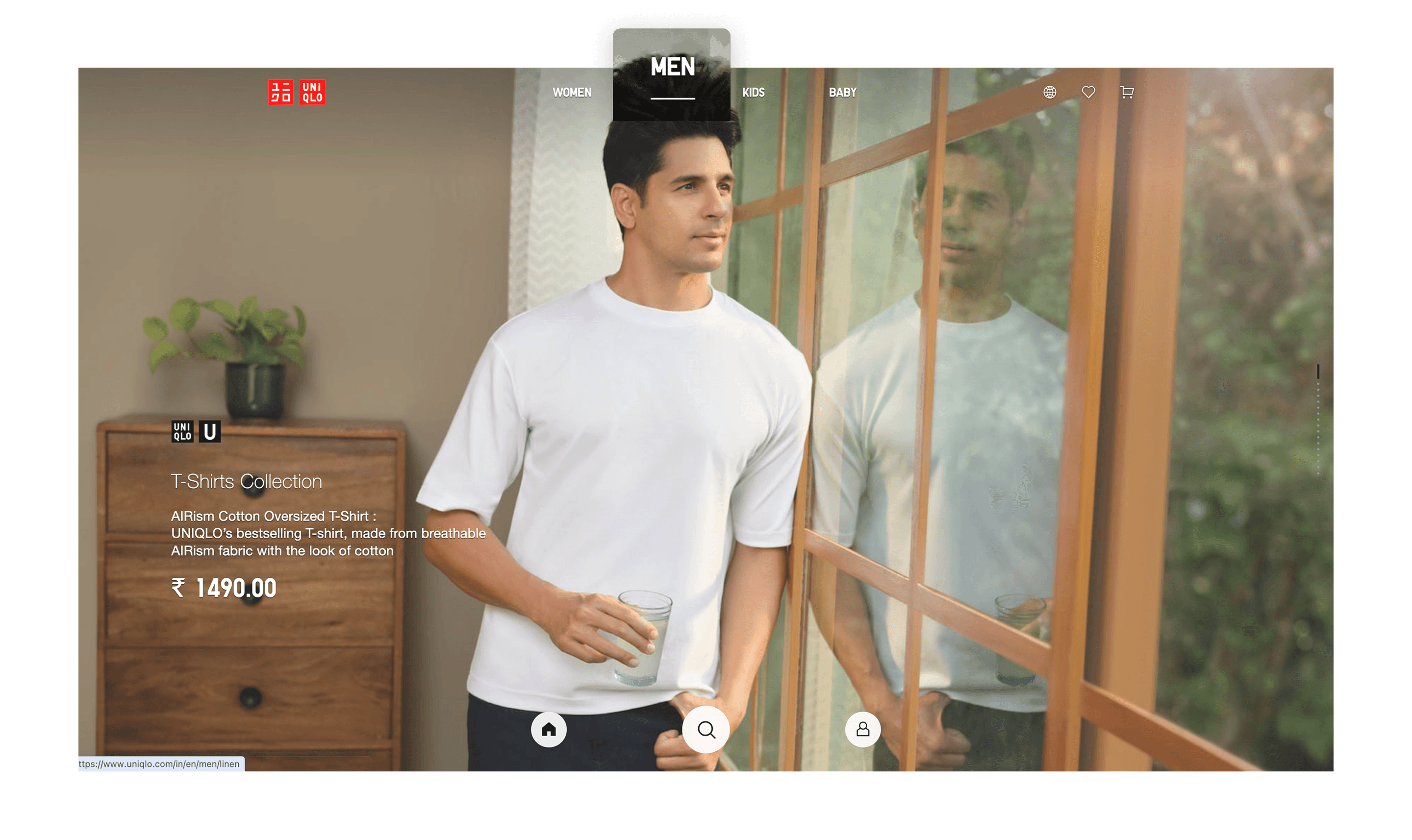
Tapping on Men, now leads you to the Men’s section, the page reloads with a new set of banner images.
So where do I find the Sub-categories now?
Sub-categories under Search: In the revamp you have one entry-point for both types of shopping behaviour - search and browse. Tapping on the Search icon now brings up both a Search box and a list of Sub-categories. While it might logically seem understandable, it is a huge step away from the “user familiarity” we established in our earlier deep dive into the top navigation. To add to that, the Search icon doesn’t really convey a Menu of Sub-categories either. The icon my brain is looking for is the three horizontal lines, not a magnifying glass.
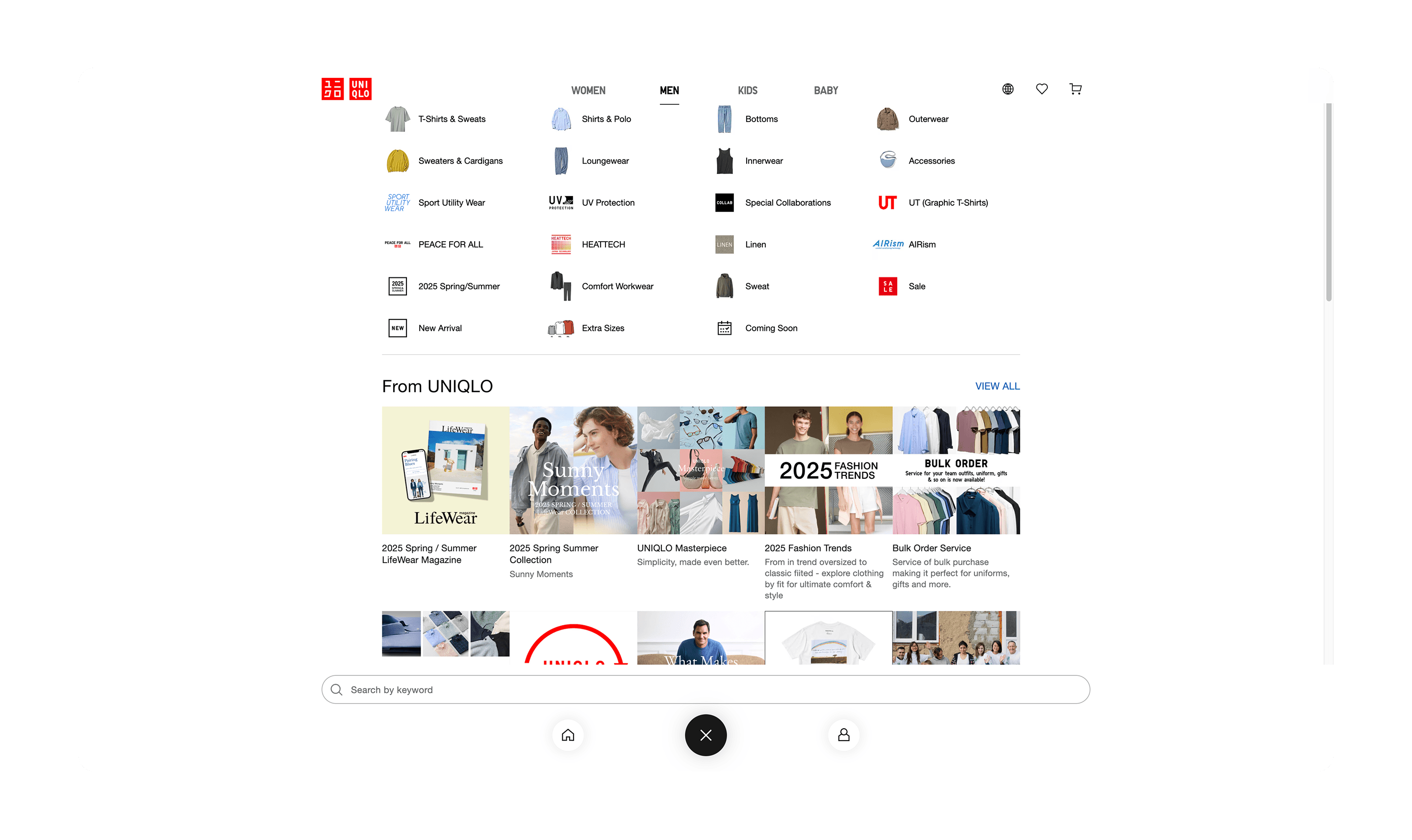
Meanwhile, tapping on the Search icon at the bottom of the page, now brings up both a Search box as well as a list of Sub-categories.
What could justify this as a design choice?
Let’s try to understand why product designers could have made that design call or building empathy for our peers. These are my hypotheses and I list these down with the intention of being more understanding of different design approaches and thus broadening my own horizons.
Establishing a platform-agnostic design system: First came the desktop web that had designers focusing on just one medium. With the introduction of smart-ish phones users started accessing desktop websites on small screens, forcing the evolution of responsive web. Which begged designers to design for 2-3 mediums depending on how many breakpoints your design introduced. With the advent of native applications designers were now translating the same screen into 5 or more mediums from dWeb, mWeb to iOS and Android. And at some point we had had enough! The solution was a universal design language that could be used across all devices and screen sizes, reducing both design and development time and effort. Moreover it allowed for a consistent user experience for any brand or company, regardless of medium. We can assume that Uniqlo was trying to do a similar thing because having Search, Home and Profile at the bottom is very reminiscent of native apps.
Most users are mobile-first: Maybe I’m the anomaly browsing Uniqlo on the desktop a lot more than on the app - I like to see bigger product images, so I prefer online shopping on my laptop. If most of Uniqlo’s users were shopping either on mWeb or the native app I could see this approach working a lot better than it does on desktop. As a mobile user I would be grateful to have search at the bottom where it’s more accessible for my index finger while holding the app in my hand. But I am still dumbfounded why they didn’t move the Categories, now Tabs, to the bottom as well, making that switch more accessible for the user. Maybe because Tabs are never at the bottom making it a catch 22 situation for any product designer?
Here’s a sample of the before and after of the same redesign on their mobile application to drive home the point of establishing a platform-agnostic design.
Uniqlo’s old mobile application.

Uniqlo’s new mobile application that follows the same design as the desktop web.
New navigation works for mobile, fails on desktop
And there are quite a few reasons why it fails on the desktop:
Higher cognitive load: The new approach breaks away from established user patterns and forces the user to take on some cognitive load to online shop.
Search is a blindspot: For one, the user is not expecting Search to be at the bottom of the page, so the user is not looking for it at the bottom of the page. And secondly the new Search icon placement is surrounded by a large ad space, which are documented to be the biggest blind spots that users skim over. This practically renders Search inaccessible and forces more travel time for the user to access what is a well designed Category menu.
Lower conversions? Because of the above two reasons I wonder if their conversion metrics took a hit post the relaunch, atleast on the desktop web. They would have eventually stabilised as users got accustomed to the new design, but my experience would expect a dip after a revamp of this order.
How could we improve Uniqlo’s new desktop web?
Without revamping just for Desktop, we could make slight improvements that would help the user experience along. For example:
Update the Search icon: If you look at their old app design, they use a Category-Search icon that signals to the user that both Search and a Category menu could be found under the icon. I would bring back the same icon for both desktop and mobile experiences to reduce the user’s cognitive load, which is already piqued because of a new redesigned digital experience.

Replacing the new Search icon with the older Category+Search icon to signal to the user that both Search and Sub-categories can be found under one click.
Improve the UI of the Tabs: Currently because the design of the Tabs feels reminiscent of a drop-down menu, I would redesign them to look more like tabs. And then we could choose whether to exercise the next improvement or not.

Improving the UI of the tabs at the top to look like tabs as well as drop-down categories.
Allow the new Tabs to also open the Category and Search overlay: Even though it is not the best approach, it would help bridge the gap between the old and new. Since the Search overlay allows me to switch category to Men or Kids as well, triggering the same layout even on the click of Tabs would significantly reduce user friction and allow for a more seamless and efficient user experience.

Using the new tabs to display sub-categories as well.
With that we come to a close on our very first design discourse. I hope this was helpful and I would love to hear your thoughts and opinions on the matter in the comments below. If there are other websites or apps you would like to breakdown, I would love some suggestions as well.
Until then, ✌️!