The things we choose to see
A quiet provocation about attention, taste, and how we build our creative selves.

Jul 10, 2025
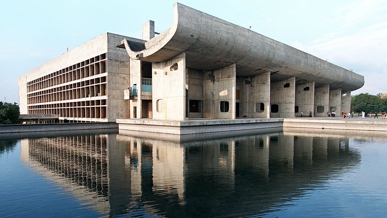
Palace of Assembly at Chandigarh Capitol Complex, designed by Le Corbusier.
Off late I’ve been feeling fatigued by social media and my mountain (or molehill) is that everywhere I look, my feed is filled with people talking about how to “be” better - from makeup to interior design or even running your own business. If social media was to be believed, you’d think we are doing nothing right.
And for a self-ascribed perfectionist, this is not so good for my mental health. The surround sound of capitalism has left a lingering bad taste in my mouth. In our co-opting of capitalism, thinly but carefully veiled as individualism, we have become the same people. We are all watching the same content about quiet luxury, a revival of mid-century modernism and how to use AI to become a millionaire.
In our pursuit of perfectly curated lives, we’ve all begun referencing from the same mood boards. And when everyone references the same things, what’s left to be original about?
This (temporary) distancing from social media, however, has left me with ample time and mental space demanding to be filled. I am craving creativity and Pinterest boards are no longer cutting it. I realised what I needed wasn’t more content but more references. The kind that stretch your perception, not shrink it.
Lucky for me, my husband, for different but excellent reasons, decided to gift me an annual subscription to Domestika for my birthday. (A great gift btw, if anyone keeps notes.)
And so, as an extension of the illustrations I was drawing a couple weeks earlier, I picked up a 3 hour long drawing course on Domestika called “Creative Drawing Techniques for Beginners”, by Pũno, in the hopes that I can find new references of creativity, art and life, that are beyond the realm of my current social media. Almost like signing up for a guided museum tour after being lost in a TikTok maze.
There were two reasons for me choosing this course over so many others. First, I wanted to learn how to translate my thoughts into illustrations and the course description fit the bill perfectly. Secondly, but more importantly, it was because the course was going to take a detour from traditional learning practices into the unconventional. And that piqued my curiosity.
My first assignment started with the unconventional. I was to look for an artist who did not conform to the rules of academic drawing. And then tell the class about this author and what I liked about their way of interpreting reality.
As a pre-cursor to the assignment, the instructor pulled a few artist references from an art collective based out of Madrid, called Debajo del Sombrero (Under the Hat). In their own words, “UNDER THE HAT is a platform for artistic creation, methodological research, and career advancement, aimed at people with intellectual disabilities”. The references the instructor choose defy any traditional drawing conventions, instead showing us art that challenged our ideas of beauty, art, perspective and proportion.


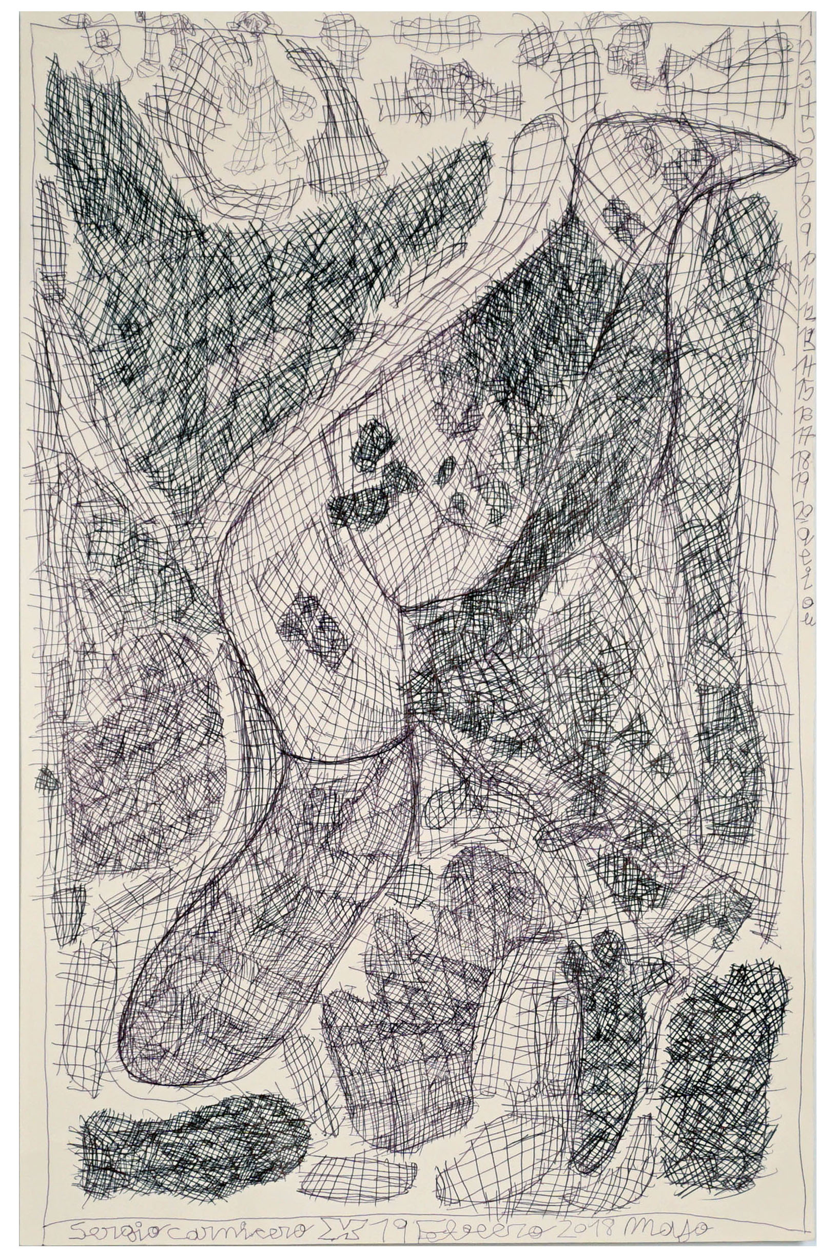
The artists shown, from first to last, are Jorge Bermejo, Maria Lapastora, Rodrigo Cabrera, and Sergio Carnicero.
This assignment forced me to look for artists who broke the rules. What I found broke something else too: my own assumptions.
____________________________________________________________________________________________
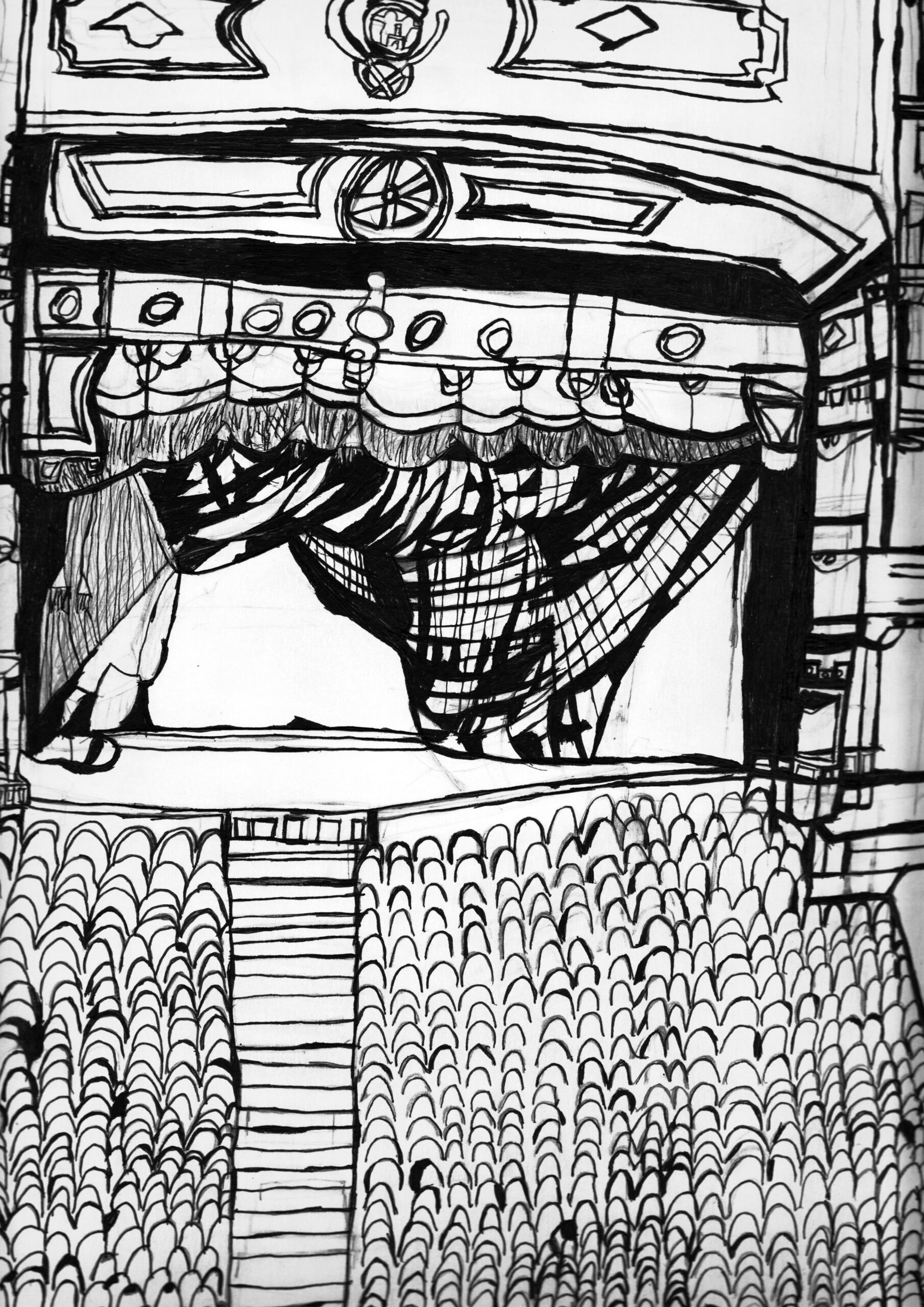
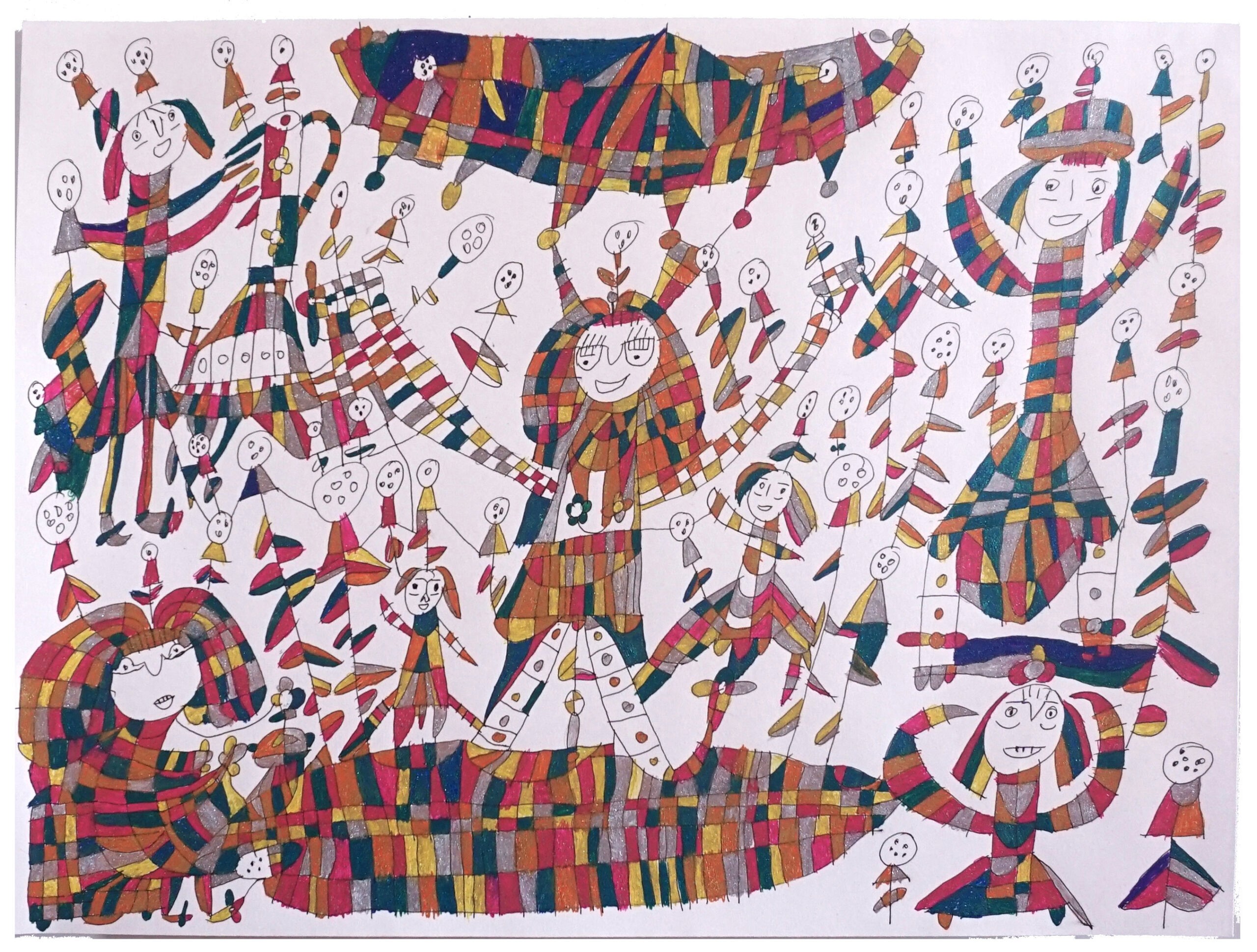
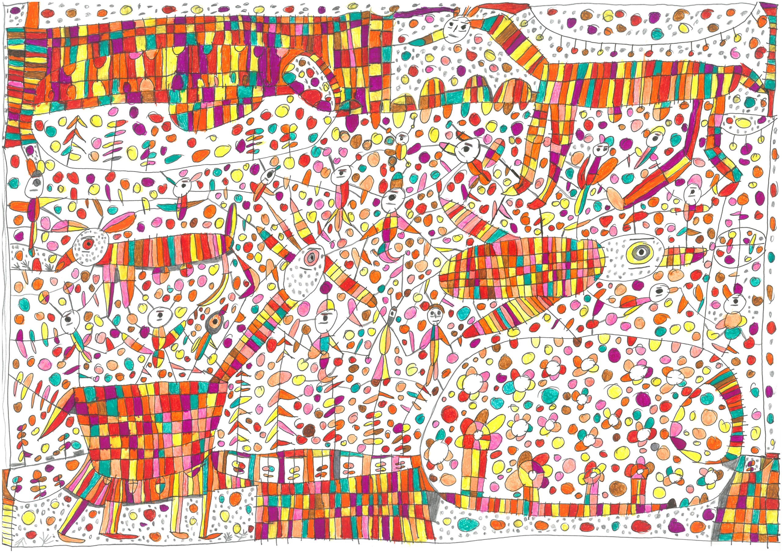
For part 1 of my show and tell, I picked Rosa Maria Herranz’s from Under the Hat, and here’s why.
Her works evokes a strong sense of nostalgia in me. If you look from afar it almost feels like a beautifully laid terrazzo floor. I want to say this art interprets a day at the zoo, but honestly, it could be anywhere. The child-like wonder and beauty lies in Rosa’s eyes, and we are all just a witness to that. Her art makes me wish I could see the world like this. Even her black and white works are “colourful”.


But for part 2, where I had to find artists in the wild, who defied the Academic Realist style of painting, I slid into a very happy black hole. I knew I wanted to highlight and talk about Indian artists, so I started my research there. While this was a course related assignment, and I could have been done with some combination of Google search and ChatGPT, I wanted to cleanse my palette with new art and artists that had so far been beyond my horizons.
The familiar undercurrents of not wanting to further my personality on the same Pinterest boards as the rest of the world, I was glad when I did not find the Indian artists I was looking for, on Pinterest. My first clue was a painting that quietly hangs in our guest bedroom. The second came as a whisper at a museum show, a passing mention by an art collector of a group I’d never heard of before: the Bombay Progressive Artists' Group.
____________________________________________________________________________________________
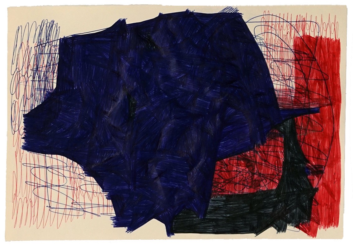
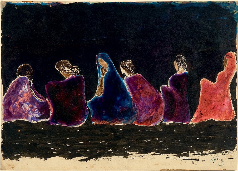
The painting is an untitled work of birds by Rabindranath Tagore, most famous for being the first Asian and Indian Nobel laureate, which he won for his book of poems, “Gitanjali”. Most students from India will know him for “Where the mind is without fear”, which without a shadow of a doubt is my favourite poem of all times.
Where the mind is without fear
and the head is held high
Where knowledge is free
Where the world has not been broken
up into fragments by narrow domestic walls;
Where words come out from the
depths of truth;
Where tireless striving
stretches its arms towards perfection;
Where the clear stream of reason
has not lost its way into the
dreary desert sand of dead habit;
Where the mind is led forward
by thee into ever widening
thought and action-
into that heaven of freedom,
my father,
let my country awake.
Rabindranath Tagore’s life was mired by tragedy and loss. First losing his childhood playmate and literary companion, Kadambari Devi, and then between 1902 to 1907 losing his wife, daughter, and youngest son. I believe most of his works are a reflection of that personal grief. His paintings evoke a deep sense of sadness and apathy in me, the viewer. I can feel their pain, see vividly the burden in their heart, but not know what’s causing it. The lingering pathos becomes a lens into my own sorrows.


____________________________________________________________________________________________
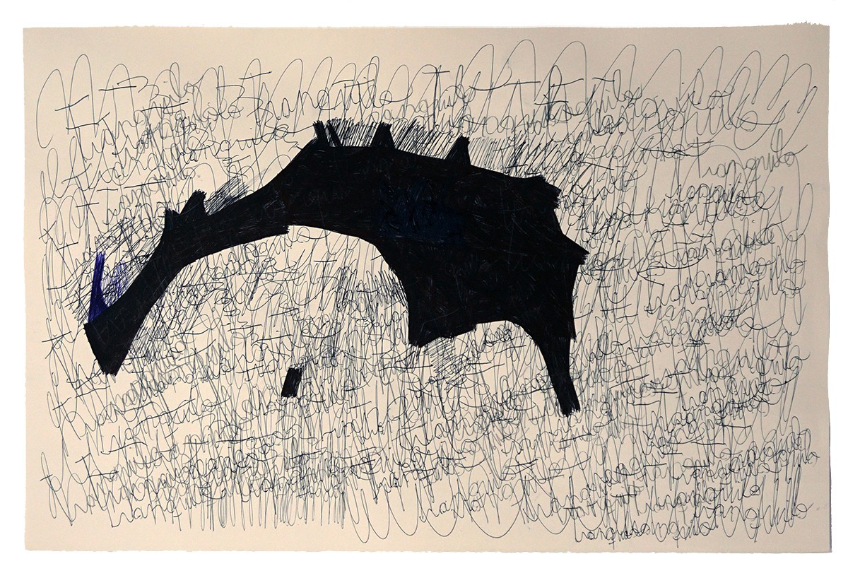
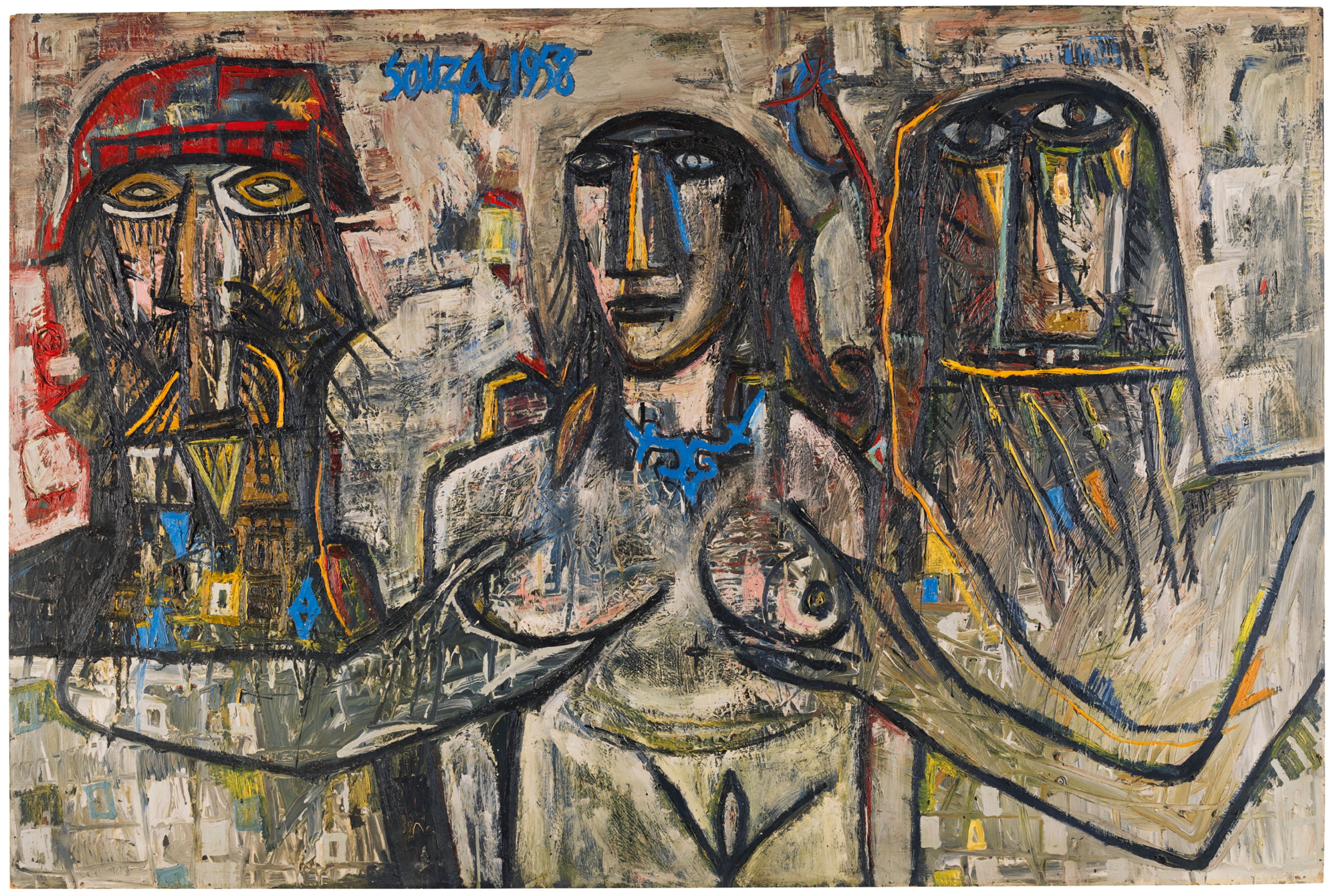
If Tagore’s grief painted in greys, Souza’s irreverence exploded in colour.
While Rabindranath Tagore and Santiniketan became the seat of the Bengal School of Art, after India’s independence, an art movement which would become known as Modern Indian Art started gathering steam. My next artist reference was Francis Newton Souza, or F.N. Souza. A part of the Bombay Progressive Artists Group, it’s most famous export being M.F. Hussain, F.N. Souza’s art exhibited both decadence and primitivism.
This untitled work by F.N. Souza is meant to be a depiction of the Old Testament story of Susanna and the Elders. The story goes that Susanna, a young and beautiful Jewish woman, refuses the advances of her husband’s elderly male guests. She is then put on trial for her life, but is ultimately saved by the prophet Daniel, who exposes the elders' lies and vindicates her.
A mis-interpretation of a religious text can get you a fatwa, but we see F.N. Souza here, interpreting what was meant to be moral instruction, in a juvenile way in the use of colours and . The use of bright colours and playfulness keep me from seeing the injustice being committed. And yet, a look into each of their eyes conveys the sinister nature of the act.


____________________________________________________________________________________________
Completing the assignment washed over me a deep sense of satisfaction, a fleeting emotion when I am clocking 5h 12m of daily usage on my phone. Instead I had just spent hours looking at art - my eyes had seen new colours, my heart felt full and my brain was rewiring itself after a new download.
Not coming from a design school, I always knew I lacked important references that could be crucial to my growth as product designer. For example, I was never taught Dieter Rams' "10 Principles of Good Design”. I believe I’ve unconsciously compensated for that lack, by building my own library of analogous references. It may not include the Braun ET55 Calculator or an Eames Lounge Chair, but it does include references from every walk of life I’m even mildly interested in. These have become my source of inspiration when I am creatively blocked and, cannot for the life of me, find the right shade of green.
So yes, Mr. Tagore and Mr. Souza now live in my library right next to a screenshot of a JW Anderson outfit, a postcard of Le Corbusier’s Chandigarh Capitol Complex, and a Jasjyot Singh Hans painting. Because building a reference library isn’t about hoarding inspiration like Pokémon cards. It’s about finding things that sharpen your gaze, that stretch how you see the world, even if only by a degree. That’s how you make sense of your own perspective.
Turns out, building a creative library isn’t about finding the rarest references. It’s about finding the ones that make you feel something. And right now, that’s worth more than any trend.
____________________________________________________________________________________________
I started writing this newsletter with the hopes that it’ll someday become a valued design blog. But as I have now written regularly for over 2 months, I have realised I don’t read a lot of “valued” design blogs myself, or even do much reading related to tech. And I can’t write what I don’t read. That’s why I’ve been experimenting with what I write. And you, my early readers, are my control group.
If you are interested in what I do read, here are a few editorials I indulge in weekly. These are some of the new frontiers where I am expanding my library of references and am constantly mining for inspiration, in no particular order. None of them are tech or product design centric.
Until next time, homies ✌️
Keep reading?