Can an AI engineer be your design co-pilot?
A lazy person's guide to Lovable, v0, Bolt and Replit.

Apr 15, 2025

Image shows UX designers creating a product prototype using pen and sticky notes. With logos of v0, Replit, Bolt and Lovable in the forefront.
TLDR: I tested four AI product builders—Lovable, v0, Bolt, and Replit—to see if they could act as genuine design co-pilots, not just generate pretty but hollow UIs. Spoiler: none are replacing designers any time soon—but a few came close to being genuinely helpful in early-stage ideation. Lovable topped the list for usability and speed, v0 was fine in a pinch, and Bolt and Replit leaned more developer-first than designer-friendly. These tools won’t craft your next award-winning app, but they might help you mock up an idea faster—or kill a bad one before it drains your time. Each tool has a quick TLDR review too, if you’re just here to skim. Let’s dive!
Can AI help you design smarter, faster?
There’s no shortage of AI engineers on the market today, promising to turn your ideas into apps with a single prompt. But could any of them actually act as design co-pilots—tools that help us think through a product, explore solutions, and get to clarity quicker?
That’s what I set out to test.
I fed the same product brief to four popular AI app builders—Lovable, v0, Bolt, and Replit—and observed how each handled ideation, design logic, and overall usability. This wasn’t a pixel-perfect bake-off. I wasn’t expecting Dribbble material. What I really wanted to know was: can these tools support the messy middle of product design, when the idea is still forming and clarity is a few prompts away?
Short answer: maybe. With caveats.
What we’re not covering
Tools like Subframe and UIzard didn’t make the cut. Not because they’re bad—but because they play in a slightly different sandbox. They’re great for wireframes and layout tweaks, but not built to support multi-screen flows or real app logic. Also, full disclosure: UIzard burned through my free components in a single session without warning me. One enthusiastic prompt and I was out. Live and learn.
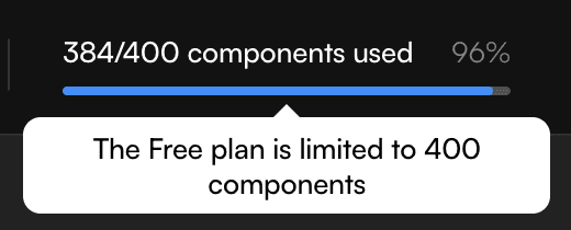
UIzard component limit
Our prompt—let’s build “Plantuary”
To keep things grounded, I chose a prompt that mirrors real-world product work: a mobile-first B2C app called Plantuary, designed for plant lovers. The task? Design a new flagship feature—Plant SOS—that lets users diagnose sick plants by uploading a photo. The brief also asked for key supporting screens: diagnosis, booking a consultation, care reminders, and a chat interface.
The goal wasn’t to ship an app. It was to test whether these tools could help me explore the space, spark ideas, and give me something I could refine in Figma later. Think of it like a Crazy 8s session—but your sketching partner is an AI.
Here’s our prompt:
Markdown prompt for AI agents to create a B2C app called Plantuary
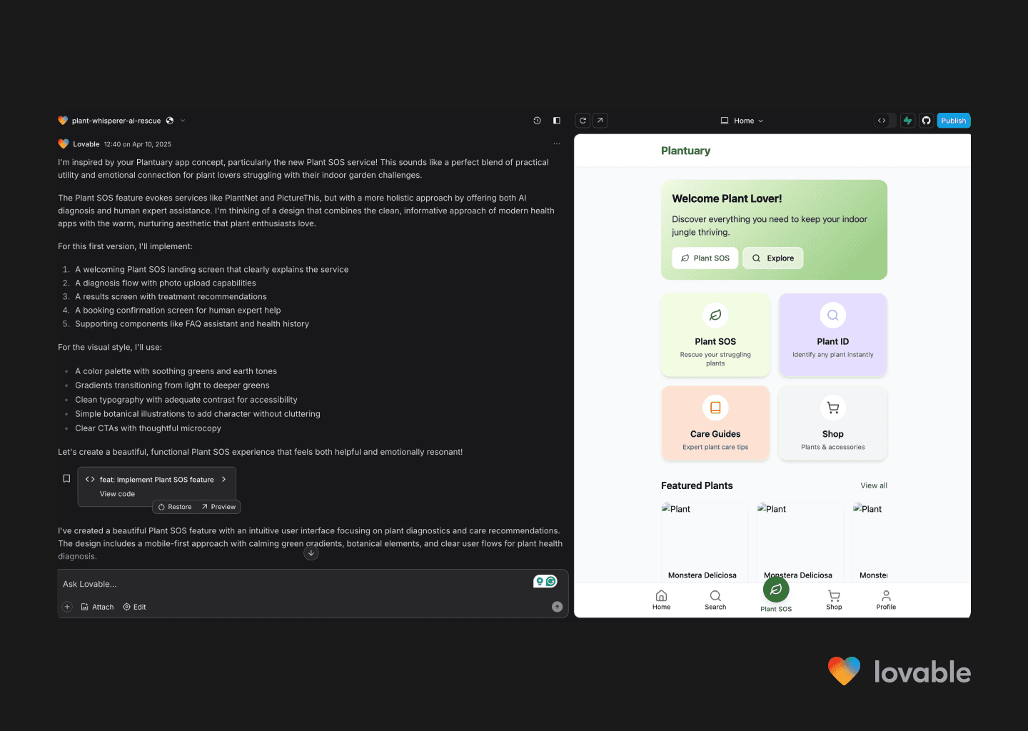
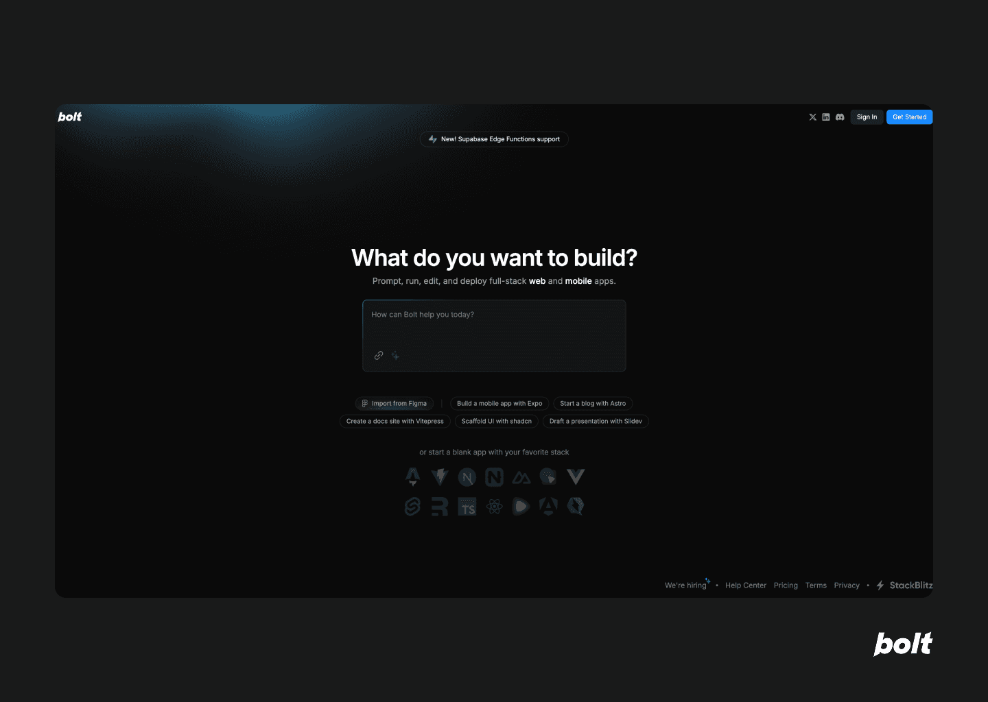
First up, Lovable—promises idea-to-app in seconds
TLDR: A clear winner. The interface was simple, the design rationale was visible, and the generated screens—while not mind-blowing—were fast, functional, and directionally on point. It followed the design brief well and even built in some edge cases (like a fallback for blurry images). The embedded chat agent was surprisingly usable. If you’re looking for a design co-pilot that doesn’t get in your way, this is the one.
I’d absolutely use it to explore flows, present concepts to stakeholders, or just bounce around ideas in early-stage product development. The output leans more wireframe than polished UI, but it’s fast, functional, and enough to spark meaningful conversations.
And that’s half the battle, really.
Lovable chat agent screen with the AI agent running on the left-side and the prompt output on the right side.
Chat agent impressions
Lovable gets the tone right from the first click. The interface feels intuitive, and the agent’s commentary on its decision-making helps you track what’s happening under the hood. You’re not guessing how it interpreted your prompt—it tells you. That transparency alone makes it feel more collaborative than most tools in this space.
Lovable chat agent screen with the AI agent running on the left-side and the prompt output on the right side.
App home
This was a strong start. The prompt asked for calming greens, subtle gradients, and botanical illustrations—and Lovable delivered. The aesthetic lands somewhere between “moodboard” and “minimum viable figma,” but it captured the direction well enough to build on.
It’s not about pixel-perfection here. It’s about saving time. Whether you’re shaping a vague idea into something more tangible, or dodging a “just add a carousel” conversation, Lovable gives you something to react to.
Designers—imagine getting this starting point without the hours of mental ping-pong. Founders—imagine not having to fumble through vague metaphors like “Netflix meets Monzo but make it green.” Just prompt, keep your browser active and go.
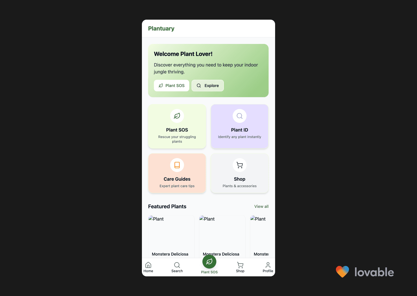
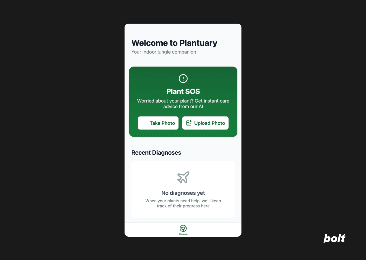
Screenshot of the Plantuary app home screen showing options for Plant SOS, Plant ID, Care Guides, Shop, and featured plants with a bottom navigation bar.
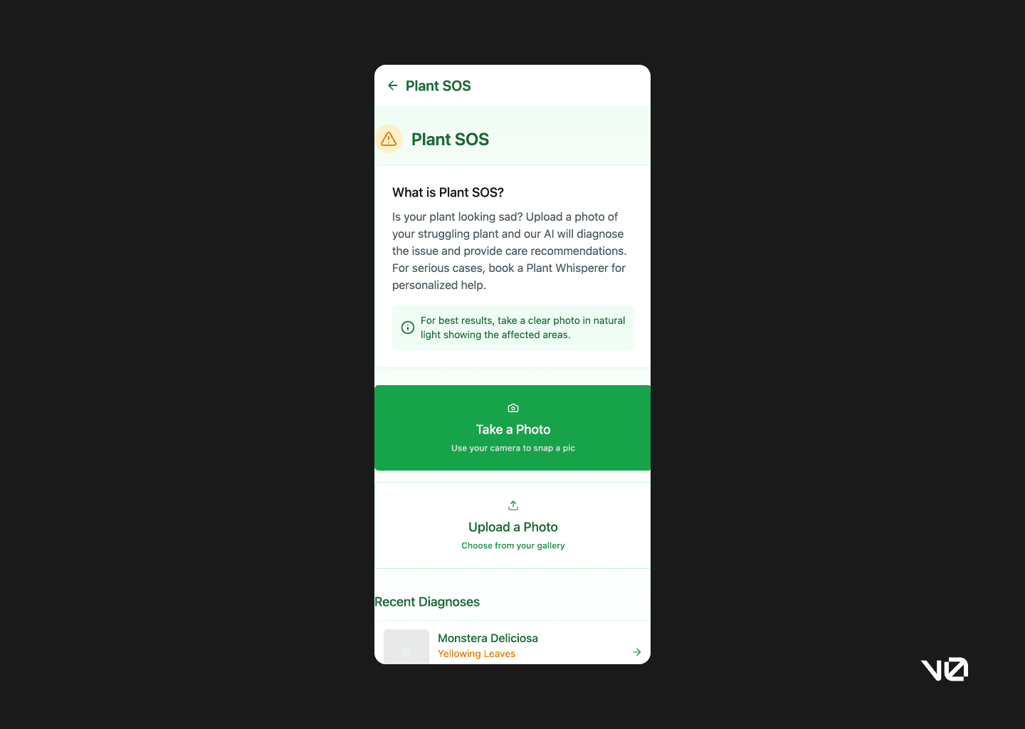
Plant SOS feature landing
The SOS page gets to the point. No onboarding screens. No guided walkthroughs. Just a clean layout and a clear action. The copy isn’t dripping with personality, but it’s solid scaffolding for a UX writer to build on.
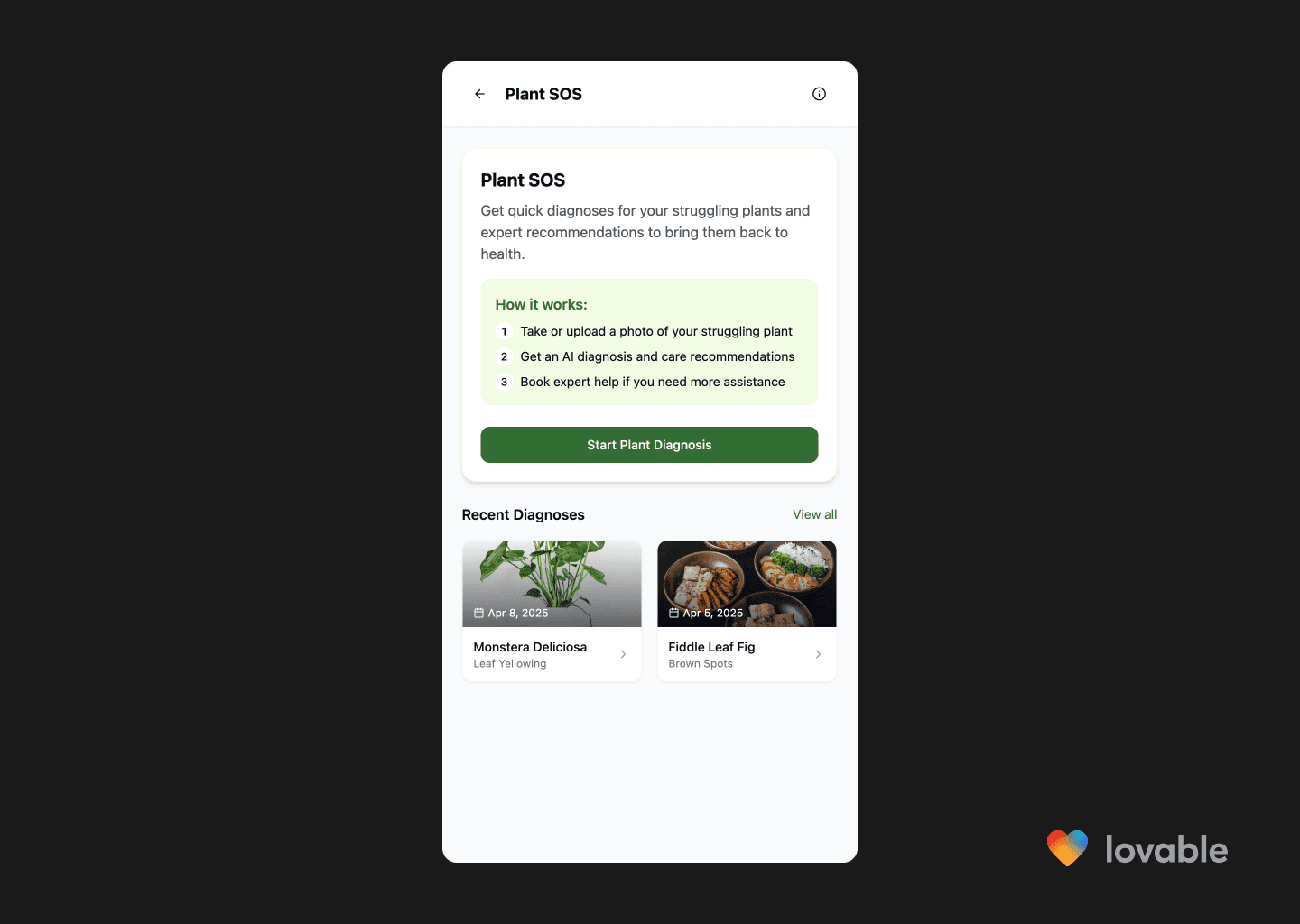
Plant SOS screen in the Plantuary app, describing steps to diagnose plant issues and showing recent diagnoses for Monstera Deliciosa and Fiddle Leaf Fig.
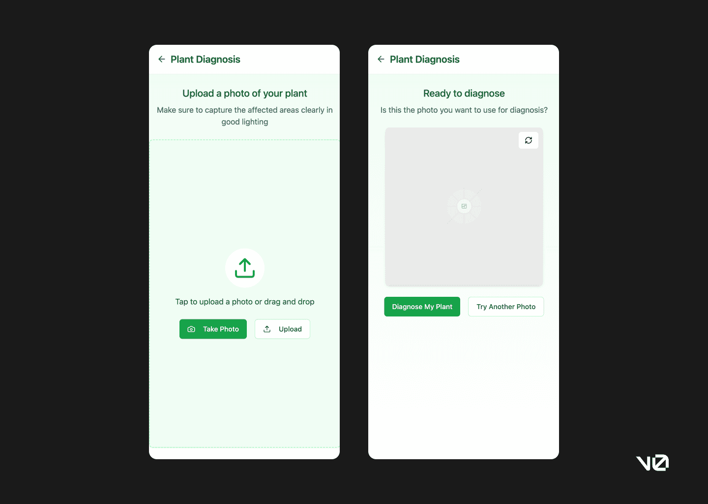
Upload a photo
Lovable doesn’t stop at the idea—it actually builds out interaction points. Uploading and taking a photo are both included, and while basic, they work. It’s the kind of scaffolding that’s easy to refine once you know what you’re building.
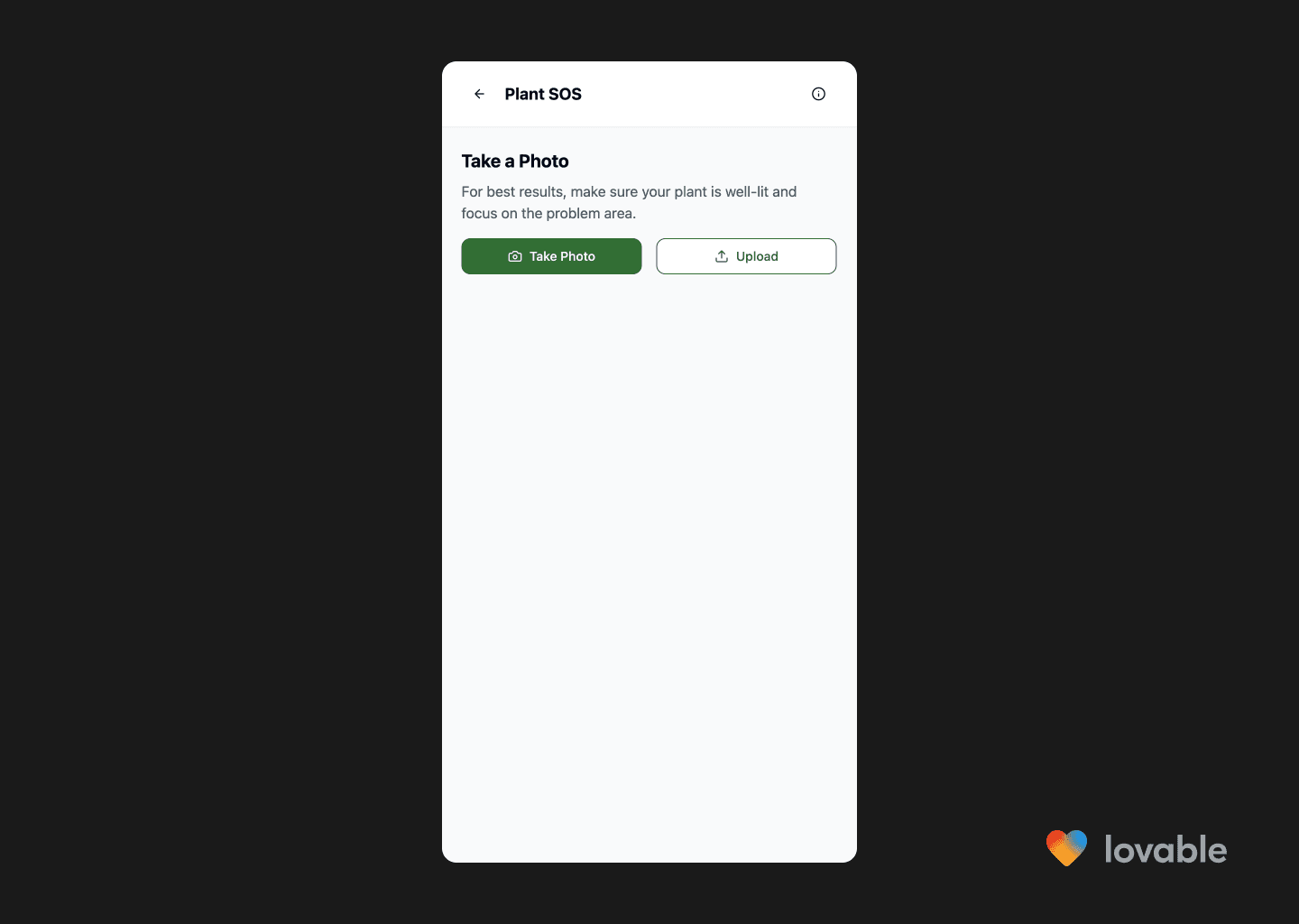
Screen prompting user to take or upload a photo of their plant for diagnosis, with instructions for best results and buttons for taking or uploading a photo.
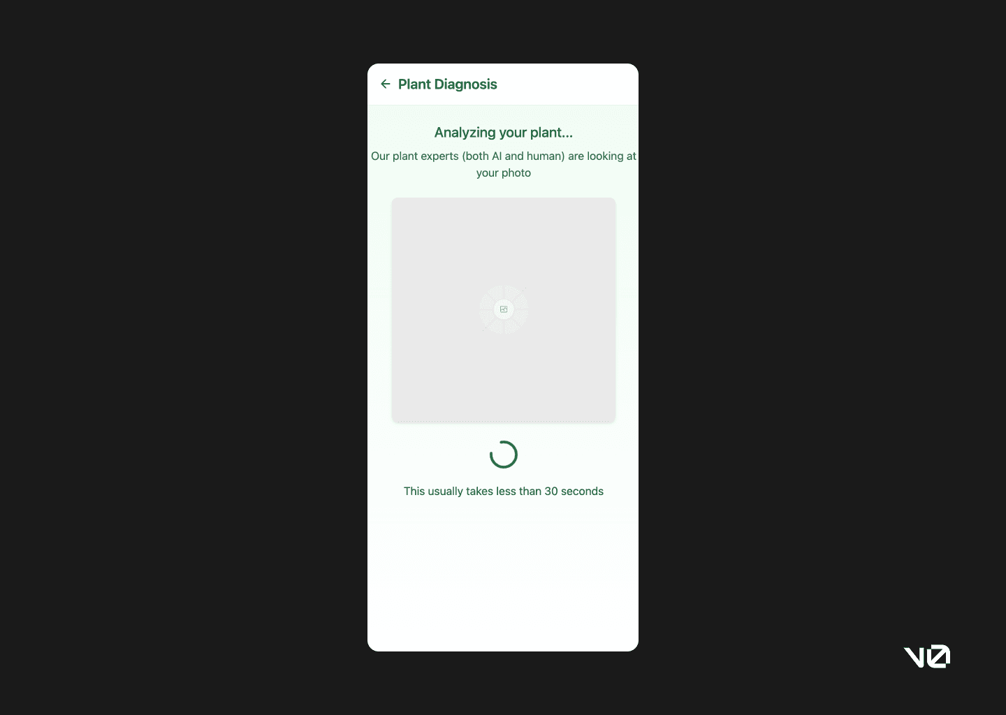
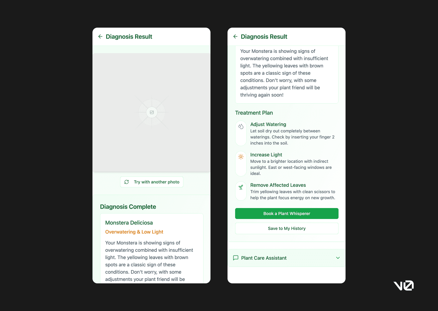
Plant diagnosis
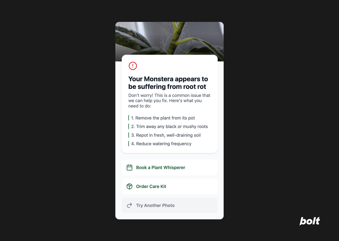
The diagnosis screen is simple, clear, and surprisingly fast. The fallback option for re-uploading a photo (in case things go sideways) was a thoughtful inclusion. The overall structure sticks to solid design principles without getting in its own way.
That said, every plant I uploaded came back with a diagnosis of root rot. Not a deal-breaker, but maybe keep the real plants away for now.
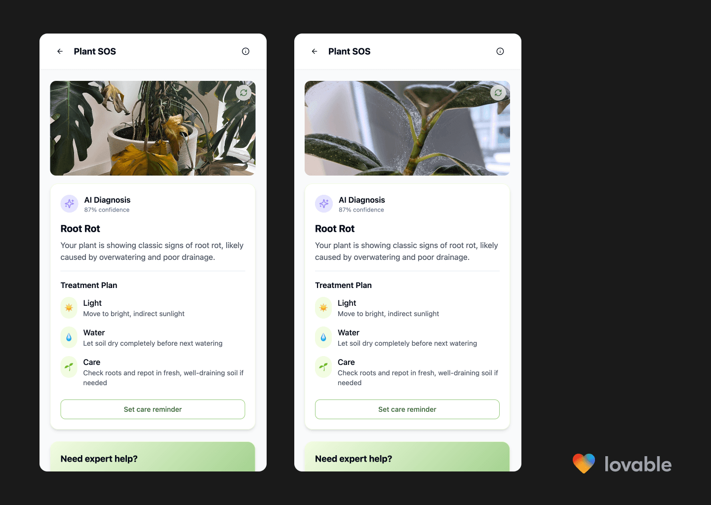
Plant SOS diagnosis result showing a plant with yellowing leaves, AI diagnosis of root rot, and a treatment plan with care reminder option.
Set a care reminder
There was a small mix-up here—Lovable interpreted “set a care reminder” as “order a care kit.” But it still built a functional reminder flow, complete with a toast confirmation. It’s a bit barebones, but honestly, so is most MVP copy.
Would I have over-engineered this? Absolutely. I’d have added time selectors, preference toggles, a full modal experience. But Lovable reminded me that simple can be smart, too.
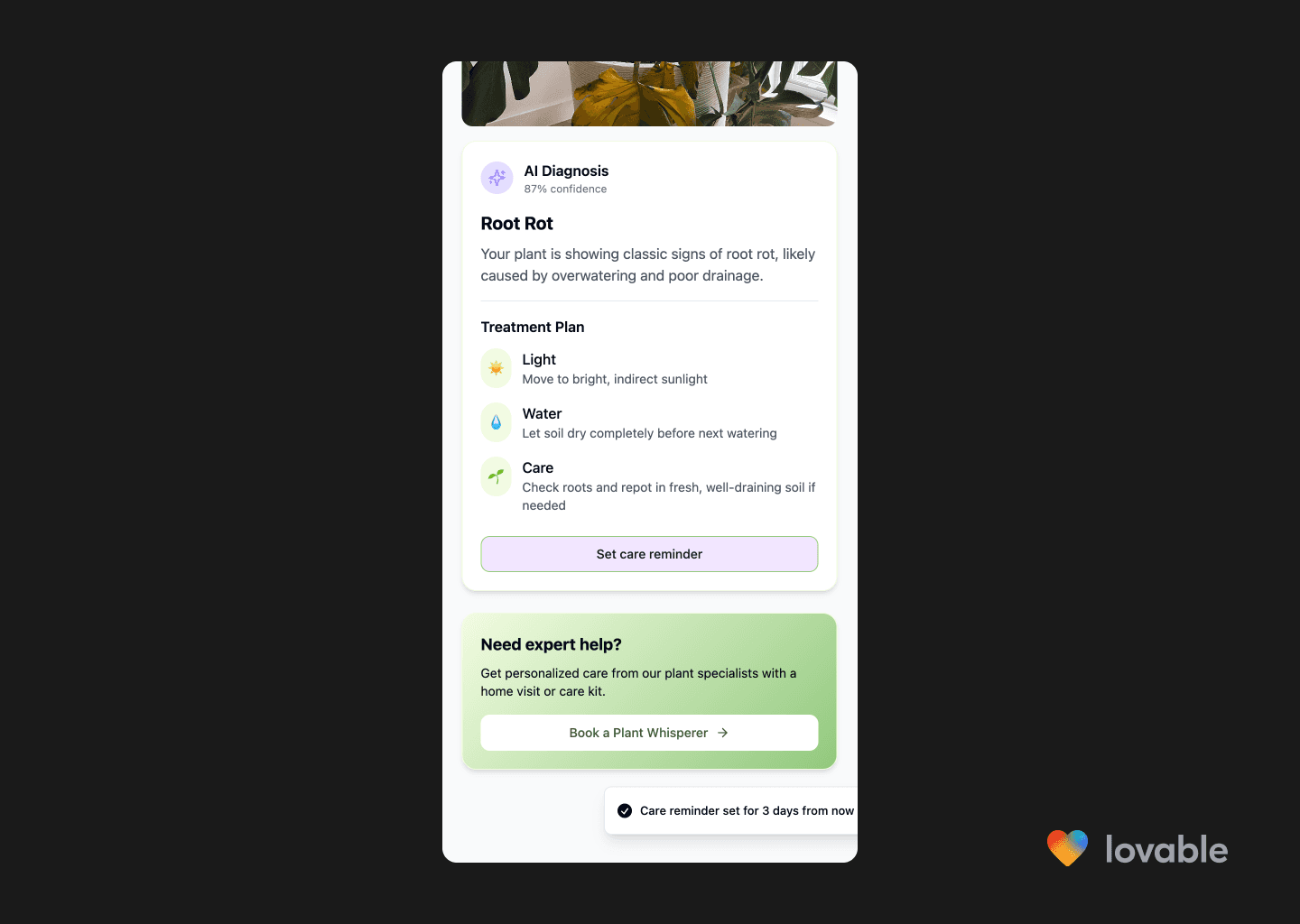
Screen to set a care reminder based on the AI diagnosis of the plant. The care reminder confirmation shows up as a toast message.
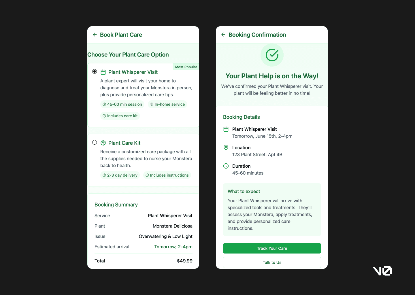
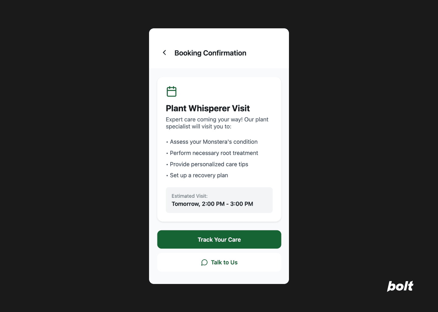
Book a Plant Whisperer
Short and sweet. The use of coloured cards to surface important details is clearly part of Lovable’s playbook, and it works well here. The only miss was the lack of pricing—something that’s essential, but likely fixable with a follow-up prompt.
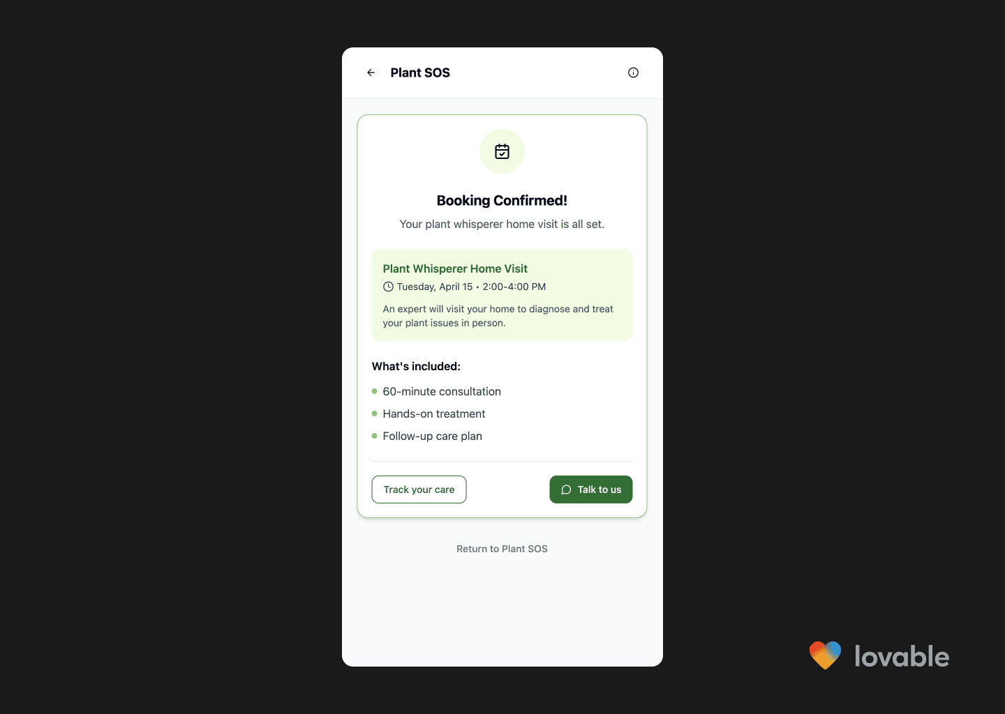
Booking confirmation screen for a Plant Whisperer home visit, showing appointment details, included services, and options to track care or chat with support.
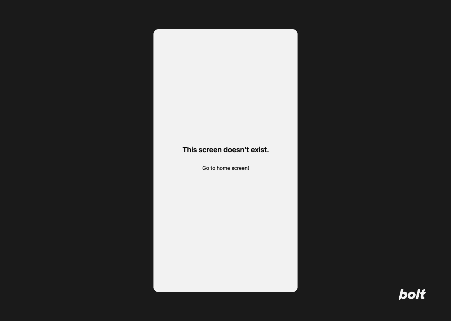
Outside the core flow, things get patchier. Clicking into non-essential paths mostly returned 404s. So while it executes well within the scope of the prompt, it doesn’t go much further.
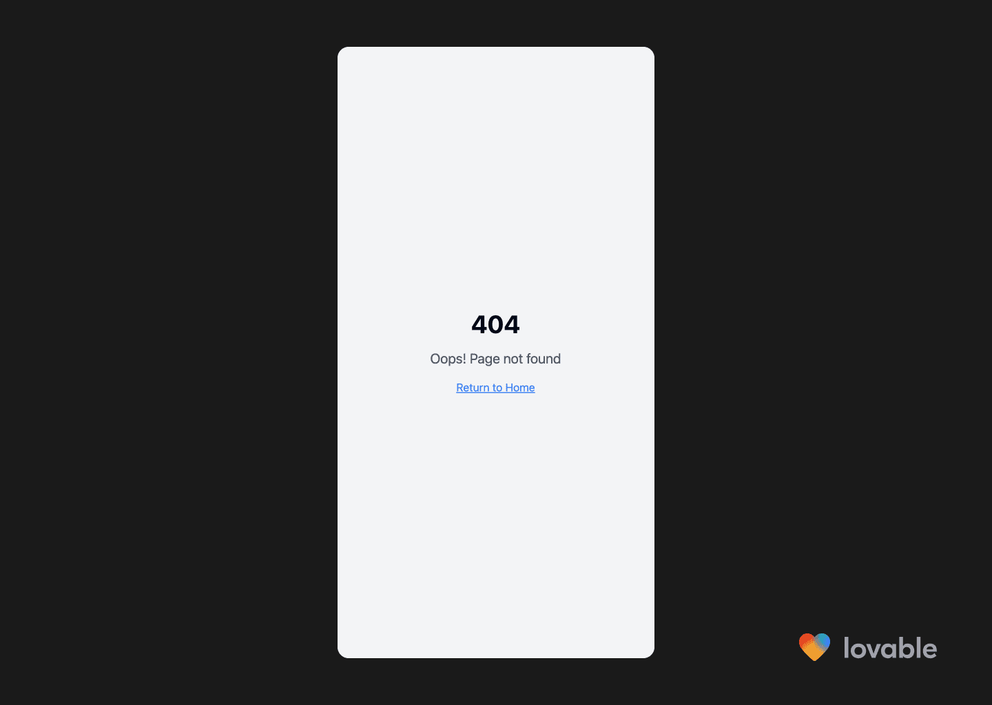
404 error page in the app with the message ‘Oops! Page not found’ and a link to return to the home screen.
Plant Care Assistant
The chat assistant built into the SOS flow was the most functional across all the AI engineers I tested. It actually worked, responded in context, and didn’t break midway through. It’s not perfect, but for something baked into a prototype? Impressive.
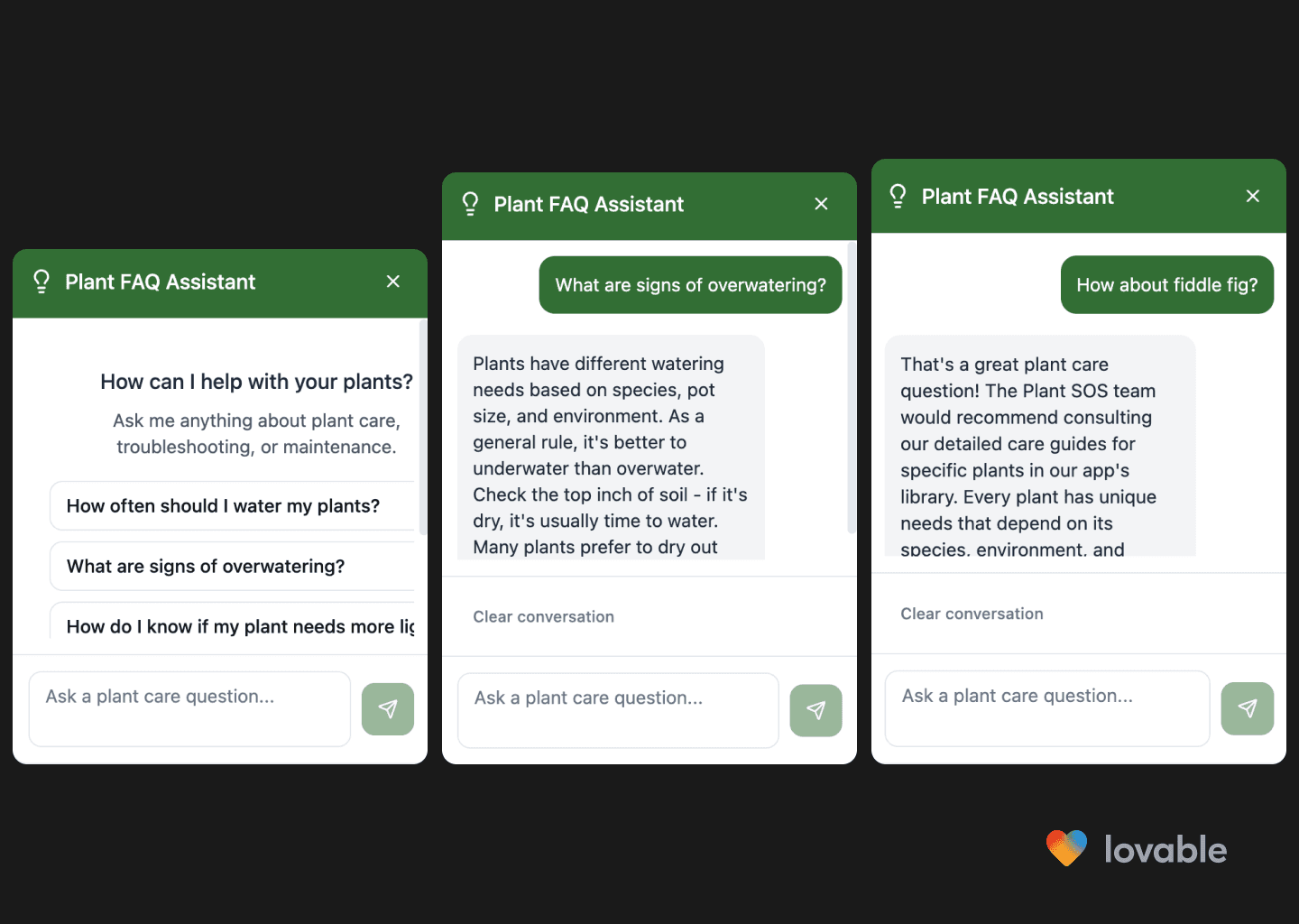
Three-panel view of the Plant FAQ Assistant chat, showing example plant care questions and detailed responses about watering and specific plant care.
Did not do
These are the prompts the AI agent did not follow:
❌ Option to “Book a Plant Whisperer” – a real-world visit
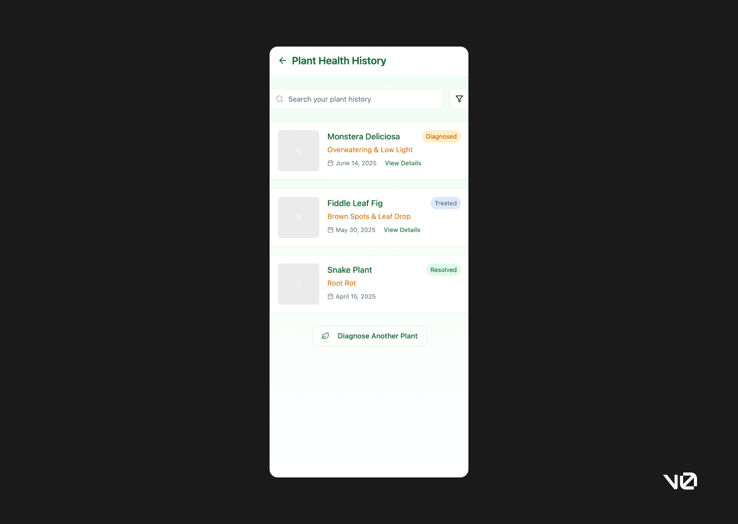
❌ Create a “Plant Health History” page in user profile to view past diagnoses, care tips, and booked services.
❌ Add offline fallback in case of no network: allow photo save and retry when online.
❌ Write the empty state copy for users who haven’t used Plant SOS yet (friendly, reassuring, educational tone).
Second competitor, v0—AI meets code meets UI builder
TLDR: Less polished than Lovable, but not useless. The UI felt a little too generic and missed key moments like bottom navigation or appropriate hierarchy. That said, the feedback loop was helpful and it delivered functional flows that could be tested and iterated on. I wouldn’t start with v0, but I’d keep it in the mix for quick prototyping — especially for simpler use cases.
If I had to present the v0 build to stakeholders as a concept, I’d brace for a lot more questions — and likely frustration — than I would with Lovable. The design and UX just didn’t feel polished or intuitive, and that makes it harder to recommend v0 as a go-to design co-pilot.
That said, I’ve tested v0 on simpler prompts (like basic landing pages), and it performs almost identically to Lovable in those cases. So while it’s worth having in your AI toolkit, I wouldn’t lead with it — more “backup option” than “first draft champion.”
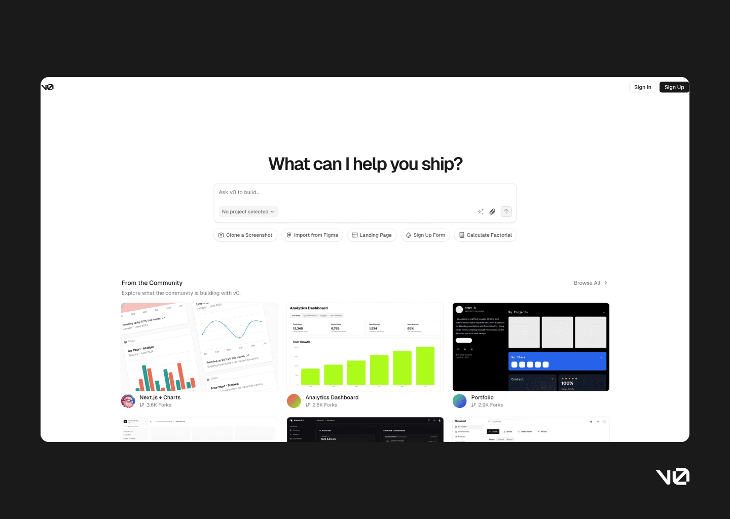
v0’s landing page: Not a lot of how-to-use-it on the landing page. But I appreciate the community builds below for inspiration.
Chat agent impressions
The interface is straightforward, which I appreciated — especially since I’m not writing code day-to-day. The chat format felt approachable, and while the left-hand panel was a bit cryptic at first, it quickly became clear that it was mapping out the app’s structure behind the scenes.
What helped most was the feedback loop built into the interface. The agent followed up my prompt with a clear breakdown of what it interpreted and built — basically a checklist of deliverables, which is surprisingly comforting when you’re flying blind with AI.
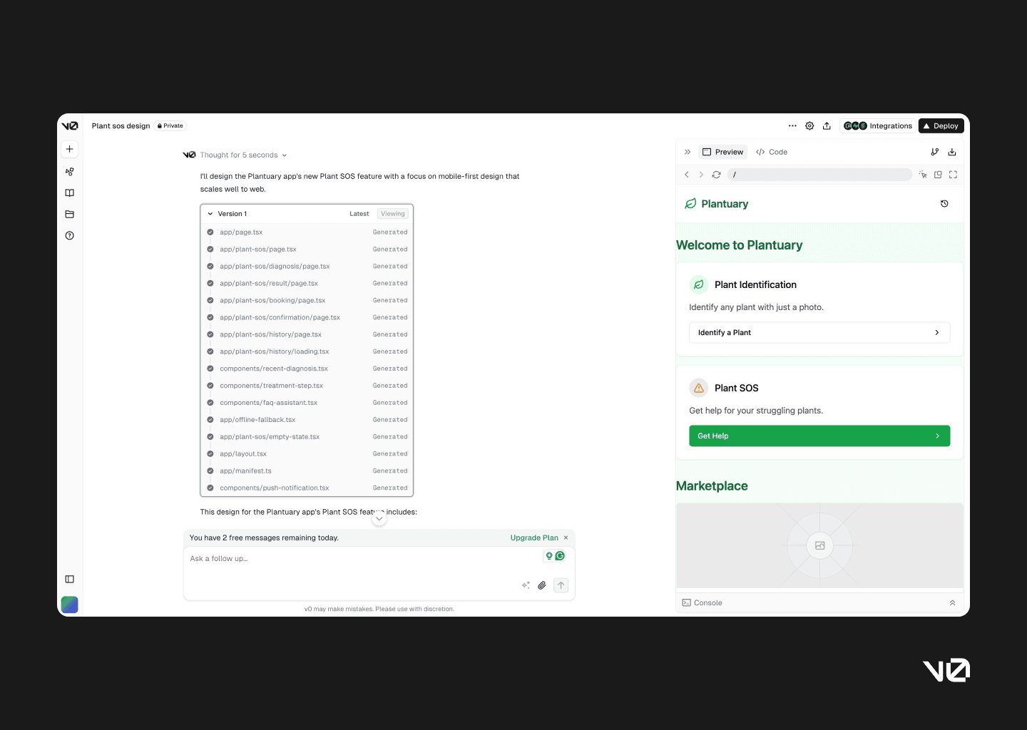
v0 chat agent screen with the AI agent running on the left-side and the prompt output on the right side.
v0 AI chat agent gives back a summary of the build, allowing you to cross-check it with your prompt for accuracy.
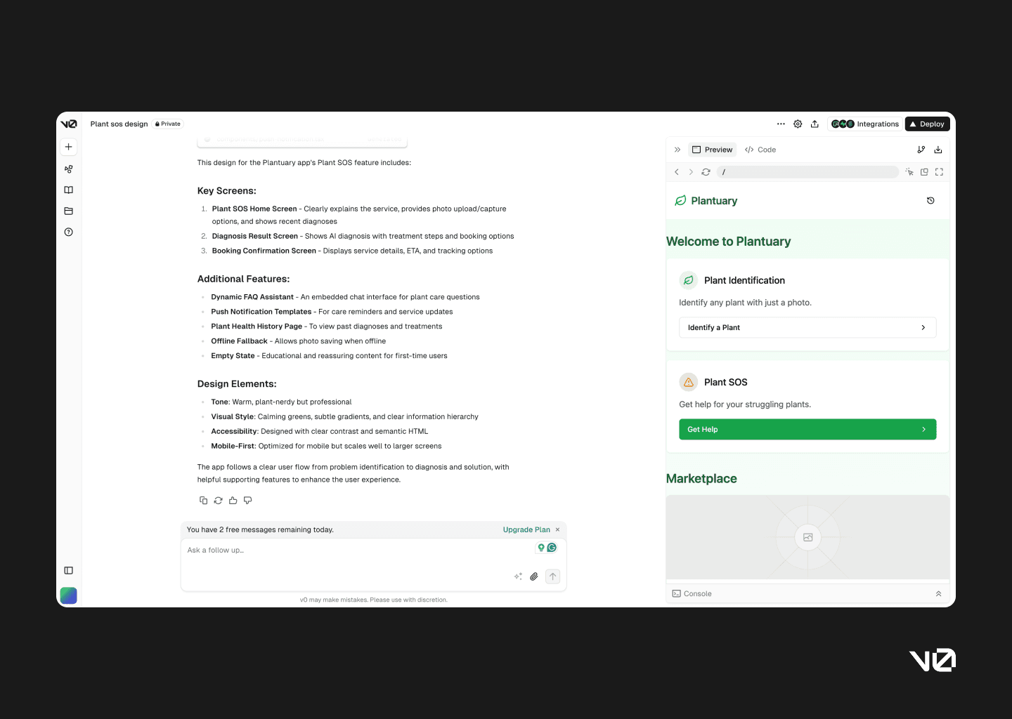
App home
The home screen was underwhelming. Basic layout fundamentals — like card padding — were overlooked, and the visual tone felt more clinical than calming. It didn’t match the prompt or the purpose of the app.
Functionally, the newly introduced Plant SOS feature was tucked under “Identify a Plant,” which makes it easy to miss. For a brand-new capability, that’s a miss. Compare that to Lovable, which made the feature feel like a core part of the experience, both visually and structurally.
Also worth noting: no bottom navigation. It’s a small omission that makes the whole thing feel less like an app and more like a series of screens loosely held together.
Screenshot of the Plantuary app home by v0, showing options for Plant Identification,Plant SOS and a marketplace.
Plant SOS feature landing
v0’s layout is card-heavy, and while that’s not inherently bad, the separation of the photo options from the main content felt disjointed. It lacked hierarchy, and the structure didn’t guide the eye particularly well.
Plant SOS screen prompting user to take or upload a photo of their plant for diagnosis, with instructions for best results and buttons for taking or uploading a photo.
Upload a photo
Both upload and take photo options led to the same new screen, which felt redundant. And even then, I couldn’t upload a photo. Once I finally managed to move ahead, I was met with yet another confirmation screen. At that point, it stopped feeling deliberate and started feeling like a UI loop.
Two screens prompting user to take or upload a photo of their plant again, and a screen to confirm to proceed with the photo the user has taken/uploaded.
Plant diagnosis
The diagnosis flow was technically complete, but heavy. A simple interaction ended up with extra steps and slower feedback. Despite being prompted to prioritise speed, v0 delivered a more drawn-out experience.
Plant SOS diagnosis result loading…
There’s a fallback button to try another photo, which is good practice — but after multiple confirmations, it didn’t add much value.
Images and icons also failed to render, which becomes a real limitation if you’re hoping to use these screens for internal reviews or concept walkthroughs.
The care assistant content, meanwhile, was buried in an accordion and leaned a bit verbose. The functionality was there — it just needed more thoughtful presentation.
Plant SOS diagnosis result page showing the AI diagnosis of overwatering, and a treatment plan with book a plant whisperer option or save to my history.
Book a Plant Whisperer and Order a Care Kit
This section was better. The app offered two versions of the consultation flow, which suggests someone was thinking about user choice and price sensitivity. The tags helped distinguish between the two offerings, and the booking summary at the end wrapped things up clearly.
It felt like a complete, usable flow — something v0 doesn’t always deliver.
Two screens for Book Plant Care screen showing options of scheduling a visit by a human or ordering a special plant care kit along with price, estimated arrival and issue summary. The second screen is a confirmation screen for when the booking is complete.
Plant Care Assistant
The chat feature worked, which shouldn’t feel like a win, but it kind of is in this space. The interaction felt disconnected from the rest of the product — like it had been dropped in from another template — but technically, it functioned.

Plant Care Assistant chat, showing contextual prompt for further questions based on the Plant SOS diagnosis.
Save to history
This was one of the more successful implementations. The UI for saved diagnoses used pill-style components for a quick visual summary, and it felt cohesive and thoughtful. A rare moment where form and function came together smoothly.
Screen showing a history of all plants diagnosed via the Plant SOS feature, including the status of the diagnosis and an option to start another diagnosis.
Did not do
These are the prompts the AI agent did not follow:
❌ Show 1-2 recent diagnoses if the user has used the feature before
Third in line, Bolt—leans more technical, dev-forward
TLDR: Developer brain, designer heartache. The interface felt intimidating, and almost every action triggered an error. When it did work, some design decisions felt sensible (like clear SOS entry points), but overall the experience was too fragile to recommend. Maybe one day Bolt will mature into a capable designco-pilot. Today is not that day.
To be fair, this tool might be better suited to full-stack app development. But for prototyping UX flows or quickly mocking screens, it’s just not ready. It feels like Bolt wants to do everything—and ends up doing very little well.
Given the time it takes to build a project here, the shallow, incomplete results are disappointing. At best, I’d use Bolt to prototype linear, ultra-simple flows. But even then, it’d be last on my list.
Bolt’s landing page: Again, really appreciate the explanation of what it can do, and suggestions of the capabilities of the platform.
Chat agent impressions
Bolt.new clearly caters to developers. The interface feels like walking into someone else’s command line—familiar if you’ve been here before, slightly intimidating if you haven’t. Despite working in tech, I found myself second-guessing what to click next.
That said, once you tune out the code-heavy interface and focus on the AI responses, things settle a bit. I appreciated that it flags issues, attempts to fix them, and leaves a record of those changes. For someone building full-stack apps, that might be handy. But compared to other tools, Bolt took longer and produced less.
The agent chat runs through a lot of technical jargon while doing the building work, great for anyone who wants to see what is happening under the hood.
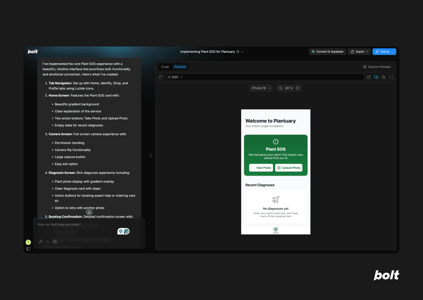
App home
The home screen is a bit of a paradox. Structurally incomplete—bottom nav shows only the home tab—but the placement of the SOS feature is one of the best I saw. Direct actions to upload or take a photo are right there, front and centre.
That clarity is short-lived. Tapping “Take Photo” led to an error. Then another. Turns out that feature doesn’t work on the web. And instead of a graceful fallback, I got stuck. The flow didn’t anticipate the issue, and I didn’t have a way out.
Screenshot of the Plantuary app home screen showing options for Plant SOS and recent diagnoses with an incomplete bottom navigtion bar.
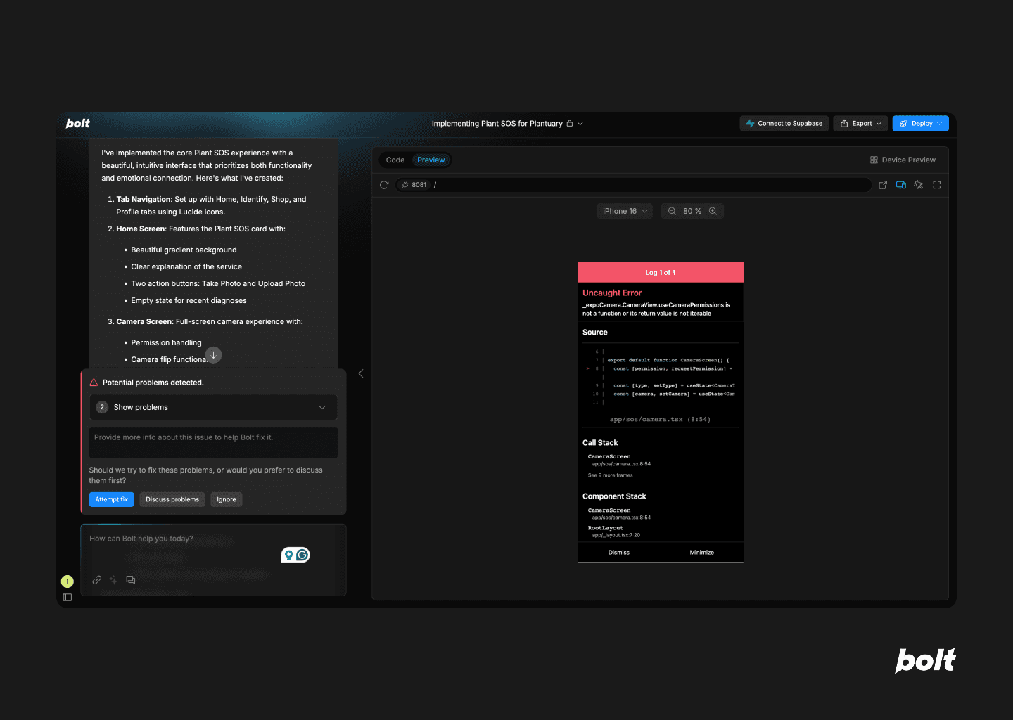
Bolt’s AI agent runs into it’s first error and asks for user’s input to attempt a fix, discuss the problem or ignore the error.
Plant SOS feature landing
This screen never showed up. There was no distinct page or flow—just a skip straight to the next stage. Which, while technically efficient, meant no space to explain the feature or set expectations.
Plant diagnosis
Here’s where the seams started to show. The diagnosis card was basic, overloaded with text, and structured using numbered lists that made scanning difficult. It felt less like a UI and more like a dev-generated content dump.
There was one bright spot: the two follow-up actions—book a plant whisperer or order a care kit—were placed at the decision point, not buried further down. That helped guide the flow logically. But “Try another photo” was tucked away at the bottom, despite not having a clear confirmation step earlier. The hierarchy didn’t quite hold up.
Plant SOS diagnosis result showing a plant with spider mites and the AI diagnosis of root rot, and a treatment plan with book a plant whisperer or order care kit option.
Book a Plant Whisperer
The appointment screen kept things minimal. Time of visit was the focal point, which made sense. But no pricing was shown—so either it’s free, or someone forgot a pretty important detail.
More importantly, it’s unclear whether the booking was even made. There’s no confirmation, no next step, no button to nudge you forward. You’re left hanging.
And if you were hoping to “Track Your Care” or “Talk to Us” after? Neither of those features worked.
Booking confirmation screen for a Plant Whisperer home visit, showing appointment details, included services, and option to chat with support.
Order Care Kit
This just didn’t exist. It was part of the prompt but never materialised—no screen, no stub, nothing.
Plantuary app screen to order a care kit that shows that the screen does not exist and instead redirects user back to the home screen.
Did not do
These are the prompts the AI agent did not follow:
❌ Show 1-2 recent diagnoses if the user has used the feature before
❌ Build a dynamic FAQ assistant for Plant SOS using an embedded LLM chat window
❌ Implement push notification templates for: Care reminders after a diagnosis, Progress updates if a user books a service
❌ Create a “Plant Health History” page in user profile to view past diagnoses, care tips, and booked services.
❌ Add offline fallback in case of no network: allow photo save and retry when online.
❌ Write the empty state copy for users who haven’t used Plant SOS yet (friendly, reassuring, educational tone).
And finally, Replit—flexible, powerful, but requires handholding
TLDR: This one gave me hope… and then took it away. Replit started strong, offering the most “realistic” app UI of the bunch, complete with functioning bottom navigation. It even implemented prompts that others ignored, like empty states and health history. But then it ran into error after error, especially during photo diagnosis. You’ll need patience—and possibly an OpenAPI key—to get much out of it. More tool than toy, but only if you’re ready to babysit. It’s just not built for fast, conceptual prototyping. This is not your “five-minute mockup” co-pilot.
Would I recommend it to a founder or designer looking to jam on early ideas? No. Would I bookmark it for a more serious project when I have hours to kill? Possibly.
Replit’s landing page: I love that they offer suggestions on how you can start, specially given how new this space is and that most users will be first-timers.
Chat agent impressions
Among all the tools I tested, Replit was the slowest to build—but also the most ambitious. It asked for multiple inputs, including an OpenAPI key, which immediately raised the bar for effort. If you were hoping to fire off a quick idea and sit back, this one doesn’t quite let you coast.
In its defence, Replit is good at communicating when it needs something and offers clear alternatives. It was also the only tool that made me pause and appreciate just how much invisible work developers do to make things “just work.” A nice little detour into empathy—though not quite what I logged in for.
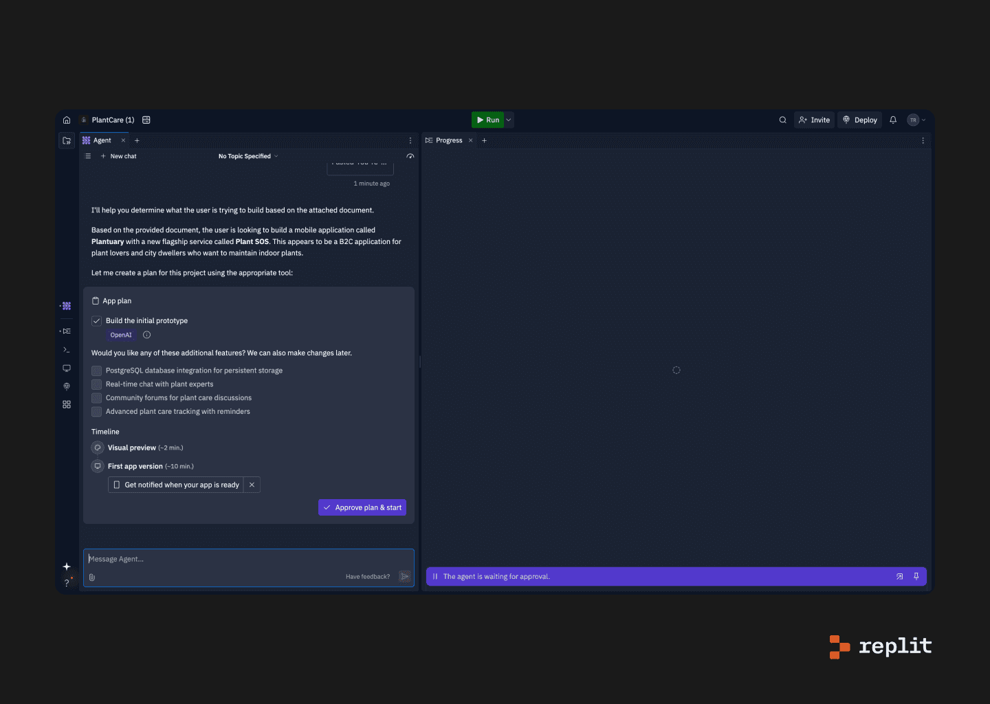
The Replit AI Agent chant screen asking for feedback on the app plan it generated post the prompt.
App home
Replit’s home screen looked the most like something you’d see in the real world. A full bottom nav, correct icons, even a status bar with time and battery—small touches that gave it an edge in polish.
The Plant SOS feature was front and centre with its own dedicated tab. And while other tabs didn’t lead anywhere (a common theme), the Profile tab actually worked. It showed booking history and past diagnoses, fulfilling a prompt that other tools skipped entirely.
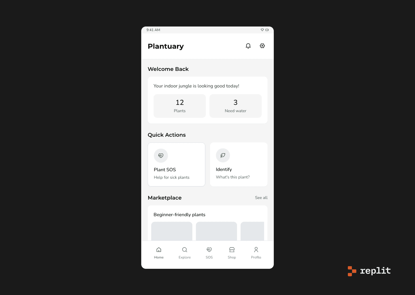
The Plantuary app home screen as designed by Replit, complete with options like Plant SOS or identify a plant as well as marketplace options. The bottom navigation is also fully functional with 5 tabs.
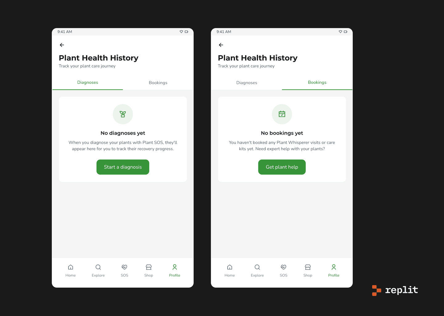
The Profile tab of the Plantuary app lays out the user’s history categorised by diagnoses and bookings.
Plant SOS feature landing
Replit took the time to frame the feature well. The landing screen explained the value prop clearly and offered upfront choices to upload or take a photo. And to its credit, it was the only tool that actually built an empty state for new users—a small but thoughtful addition.
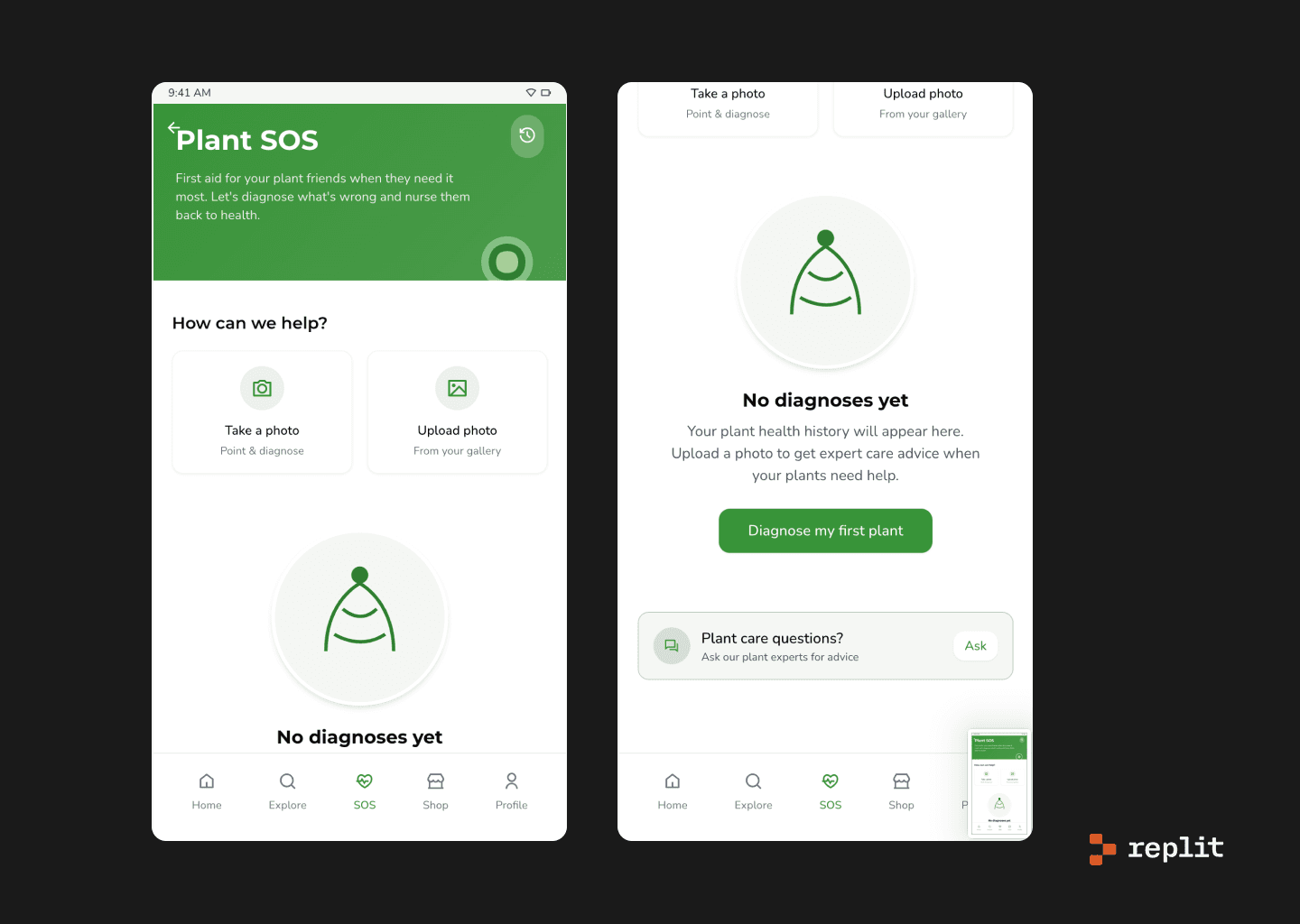
Plant SOS screen in the Plantuary app, describing steps to diagnose plant issues and showing an empty state if user has no prior history of using the feature.
Upload a photo
This part was surprisingly polished. There was a camera interface mockup, helpful hints for getting a good image, and even a two-step confirmation flow. It felt purposeful and grounded—like someone had actually considered how this would play out in the real world.
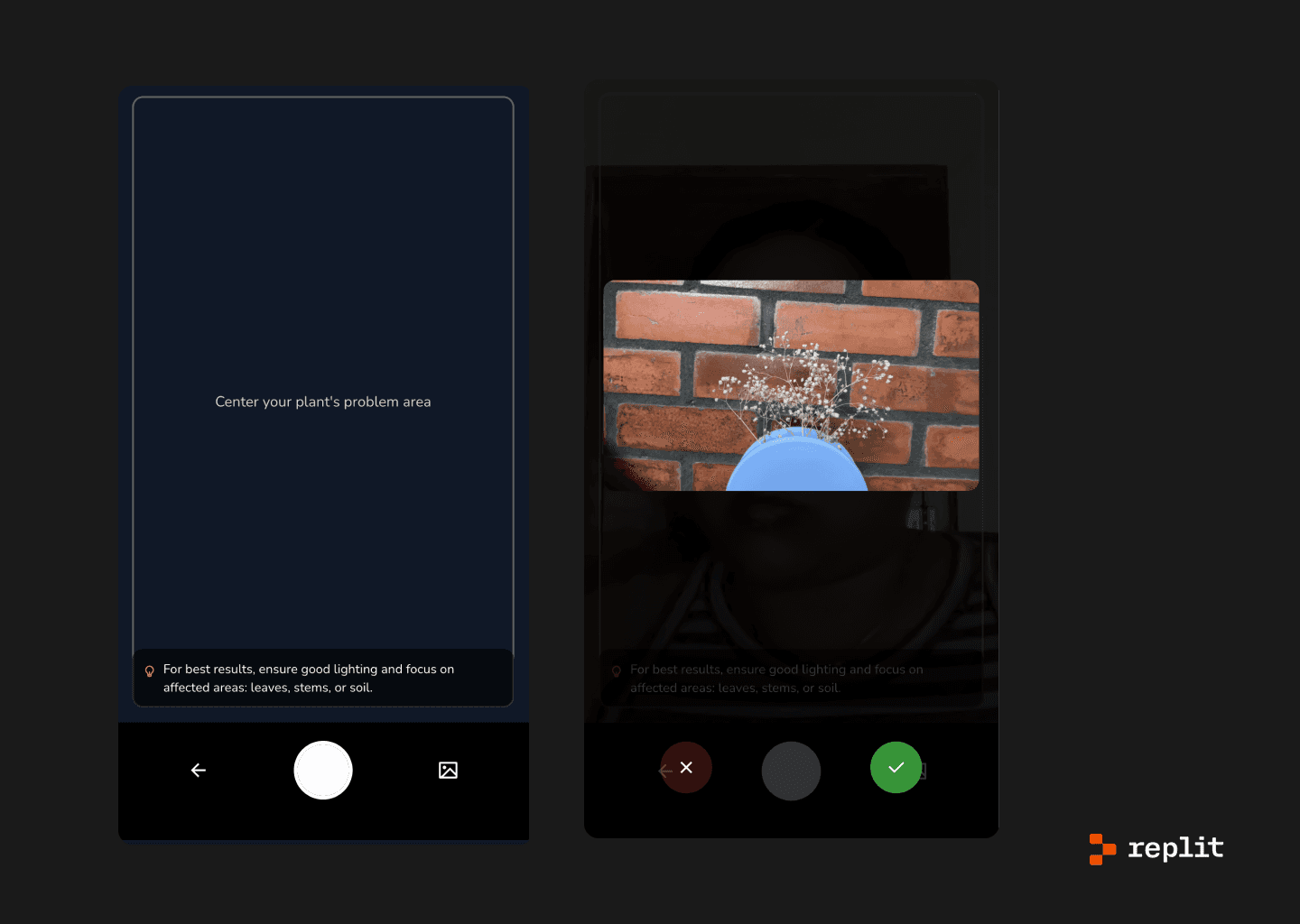
App screen showing the camera interface for the take photo screen.
Plant diagnosis
Unfortunately, this is where the wheels came off. After all that setup, I didn’t get a diagnosis—just error logs. Not even a loading screen to hide behind. It was like pulling back the curtain and realising the wizard is just a broken terminal.
I tried troubleshooting with the AI agent, but it only offered more errors. Eventually, I gave up and opened TikTok. That kind of session.
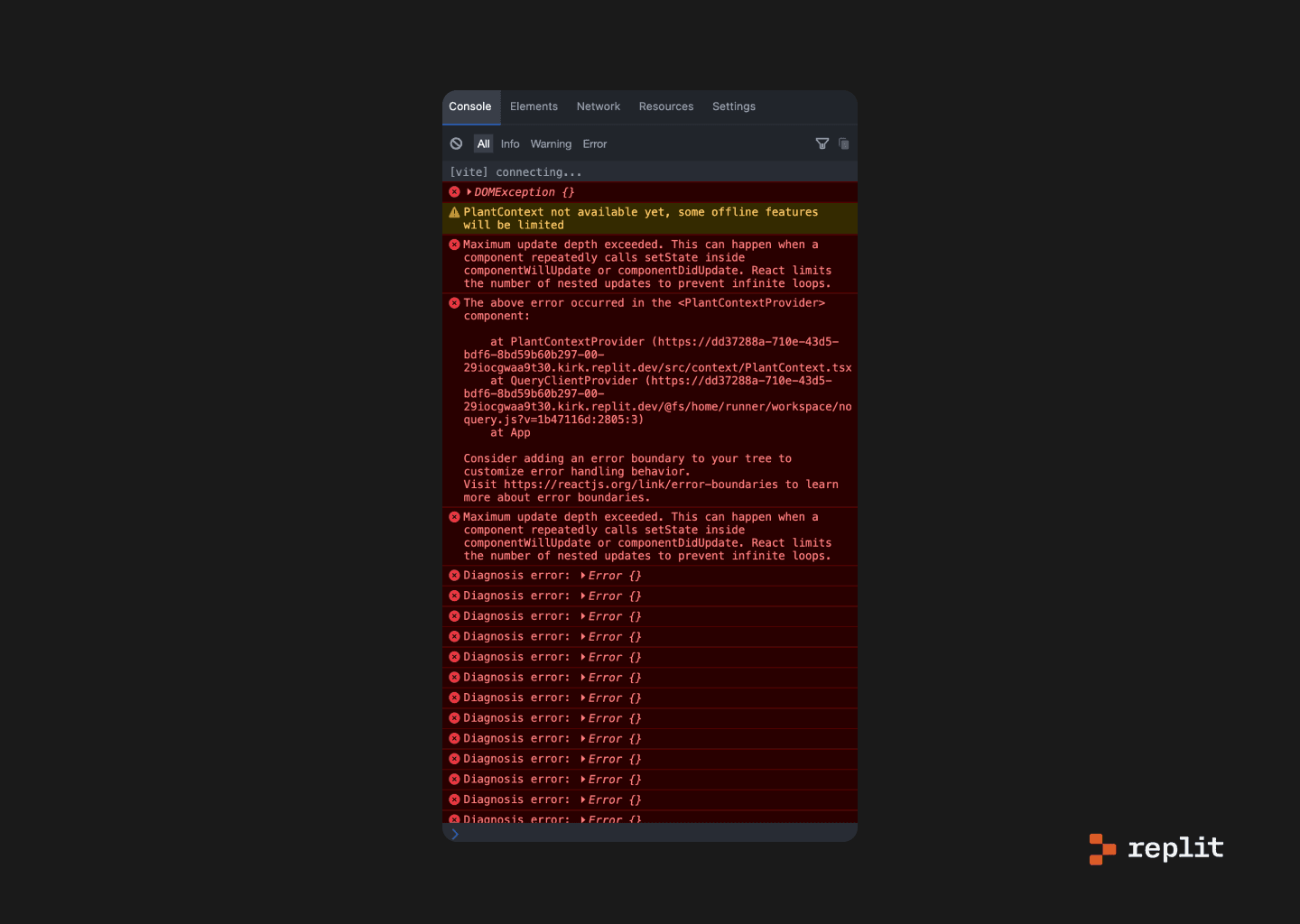
App screen showing a diagnostic error after going ahead with the photo of the plant.
Replit AI agent fixing the earlier issue it ran into after my prompt.
Plant Care Assistant
There was a working chat assistant that suggested prompts and seemed functional… right until I hit my usage quota. A useful reminder: “free” often means “you get the gist.”
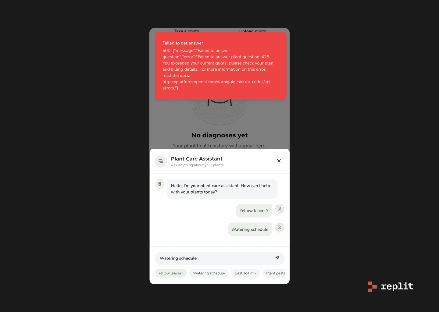
View of the Plant Care Assistant chat, showing example plant care questions but not responding because of free limit exhausted.
So, can they co-pilot?
Yes—but only after you’ve done the thinking.
These tools aren’t your creative sidekicks—they won’t dream up bold ideas or reinvent UI. What they will do is help you test quick concepts, mock bad suggestions without opening Figma, and save time during alignment hell. Think of them as eager interns: fast, helpful, a little clueless.
They shine once you’ve done your thinking and just need to visualise a few ideas. Not for soul-stirring UI, but solid for sanity-saving speed. Handy for designers, useful for founders—but nobody’s out of a job (yet). Use them wisely, and always trust your gut more than your prompt.
If I had to rank the tools:
Lovable takes the crown. Easy to use, fairly thoughtful design logic, and solid enough to be considered a legitimate design co-pilot.
v0 comes in second—less polish, but decent for rapid ideation and concept testing.
Bolt and Replit? Not quite there yet. Less intuitive, more developer-centric, and in need of tinkering before they can be fully useful to most designers.
Use them wisely, and always keep your Figma open.
I’d love to hear how you’re using (or experimenting with) AI in your workflow—drop me a note or share your favourite tools, wins, or facepalm moments.
Until next time, ✌️!