top of page
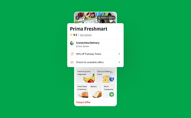
Components of the GrabMart Merchant Page
-
A new design era was on the horizon and Grab had to ask - what did it mean to be a design forward super-app in South East Asia?
-
We were surrounded by two extremes - clean, minimal design of the West and the fit-all-you-can-in-a-page design of Asia
-
When I took a stab at overhauling the Mart order page, I quickly realised that a dupe of the Food restaurant menu was not going to cut it. I had to adapt to the grocery buying experience:
-
Search adoption spurred on by the expanded cell design improved conversion rates marginally
-
Addition of category shortcuts aided discovery of merchants of various sizes with improved navigation
-
Tighter grid view of items improved time spent on page
-
Along with the Quick Add button, increased the avg. items users added to basket per session
-


bottom of page